

10 Most Expensive Design Mistakes (Ever)
A dig into small costly mistakes that designers, product builders still make.
👋 Hello! Welcome to this week’s ADPList’s Newsletter; 🔒 subscriber-only edition 🔒 weekly advice column. Each Tuesday, we tackle design, building products, and accelerating careers. We’re looking for sponsors! If you’re interested to sponsor our newsletter, let’s chat!
🔒 Subscriber’s Exclusive: Join ADPList Design AI Course: Unlock the Power of Design with AI today
We’re thrilled to partner with Freepik to launch our Design with AI Course. An exclusive 1-week program on supercharging design with AI and, build AI-first design workflows that will boost your productivity.
Get 30% discount as a subscriber today (limited to 100), U.P $30: ADPLISTSUBSTACK
Readers, we’re back with a hit newsletter this week.
As you’d know, the saying that “good design is obvious” is a tale as old as time. As Steve Krug once said, “Your goal should be for each page or screen to be self-evident, so that just by looking at it the average user can say “I get it.”” - Steve Krug.
Today, we’re going to dive deep into the principles of “Don’t make me think” and these are timeless principles that can be applied to any type of product we interact (whether it is a microwave, tv, smartphone or car). We will talk about things including:
Creating effective visual hierarchies
Don’t reinvent the wheel
We allow personal feelings take over the process
You ask the wrong questions
Much more points
The 10 Most Expensive Design Mistakes (Ever)
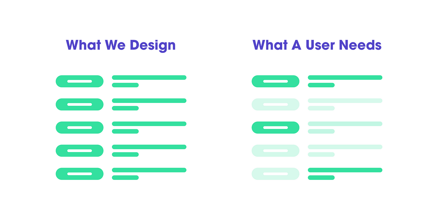
1. We don’t read, we scan
The reason for that is — we are on a mission, and we only look for the thing that interests us. For example, I don’t ever go to second page of Google. Why? Because most of the web users are trying to get something done, and done quickly. We do not have time to read more than necessary. And we still put a lot of text because we think people need to know that.
🔮 Key Takeaways
Use plenty of headings — they tell you what each section is about or if they are relevant to the person. Either way, they help you decide to scan further or leave the website.
Keep paragraphs short — long paragraphs makes it harder for readers to keep their place, and they are harder to scan than a series of short paragraphs.
Use bullet points — almost anything can be a bullet list. Do you have a sentence that separates many things with comma? Then it can be a bullet list.
Highlight key terms — Formatting the most important one in bold, makes them easier to find. Don’t highlight too many things because it will lose effectiveness.
2. Create effective visual hierarchies

Another important aspect that will help scanning a page is offering a proper visual hierarchy. We have to make it clear that the appearance on a page portrays the relationship between elements. So there are a couple of principles for that…
🔮 Key Takeaways
The more important something is, the more prominent it is. The most important stuff are either larger or bolder in distinctive colour set.
Things that are related logically, are related visually. For example, things are similar by grouping them under the same visual style, or under the same heading.