

100 unicorns: 7 different design truths
Things you want to keep in mind!

Hi, I’m Felix! Welcome to this week’s ADPList’s Newsletter; 🔒 subscriber-only edition 🔒 weekly advice column. I write high-quality insights on designing products people love and leadership in tech. If you’re interested in sponsoring us, let’s chat!
P.S. 🚨 Big News—Kunal Shah, Founder of CRED, will be coming to ADPList’s exclusive live interview on April 26th. Limited seats are available 👉 register free today! 🚨
Today, I’ll be walking through the maze of design practices and principles—whichever term you use. A well-designed experience is the answer to two questions:
How does it make people feel and behave/react?
Why do they react this way?
And the answers are correlated. In the chart, I share reasons why consumers love a particular product and arrive at why it actually works for them, based on my research of 100+ unicorn startups and public companies.
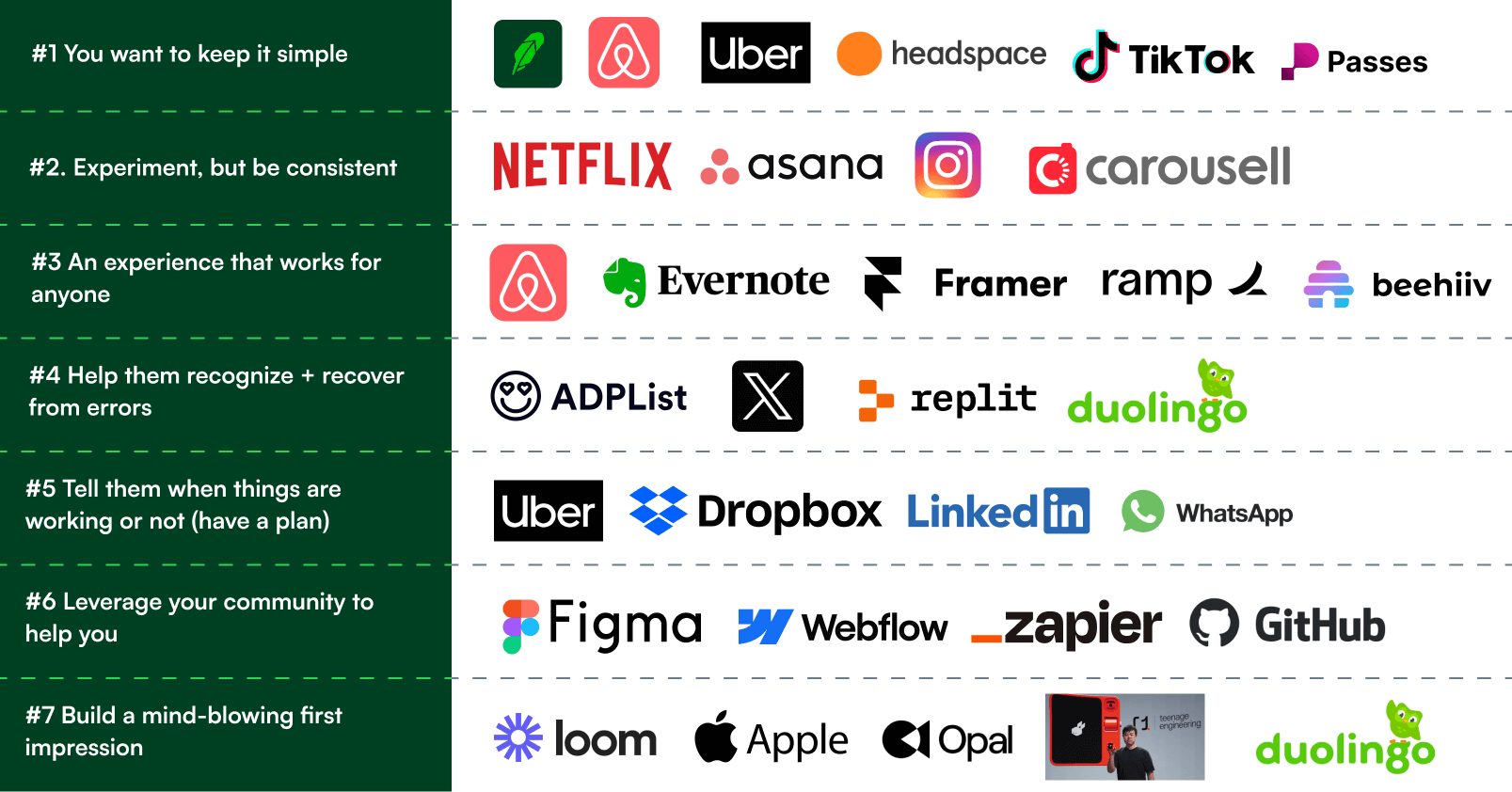
#1 You want to keep it simple.
Ideal for: If the product is high intent, and consumers already have complicated solutions in the market & are frustrated by the lack of good experience.
To minimize complexity and cognitive load for users. Clean interfaces, uncluttered, and easy to understand.
Examples
Robinhood: Rich Bessel (Robinhood’s Former Head of Design)—emphasizes why simplicity matters for them in this industry. “At Robinhood, we’re conscious that design, beyond the words, communicates who a product is for. We’re focused on design that’s friendly, that’s inviting, that doesn’t intimidate you, that isn’t condescending.” Stock trading used to be hard—when Robinhood launched, they made it so simple that buying a fraction of a stock is a swipe up. [Source]
Google: The Google homepage is an excellent example of simplicity in UI design—and just simply find what you want in direct search results.
Headspace: Meditation is a difficult task for anyone, but if you ever tried Headspace— you know it works. It’s a minimalist design with clear navigation, and it gets you started quickly—mindful design they call it. [Source]
#2. Experiment, but be consistent.
Ideal for: Products aiming for intuitive user experiences across different platforms or services. Keeping interface elements consistent cross the platform so users don't have to relearn functionalities.
Examples
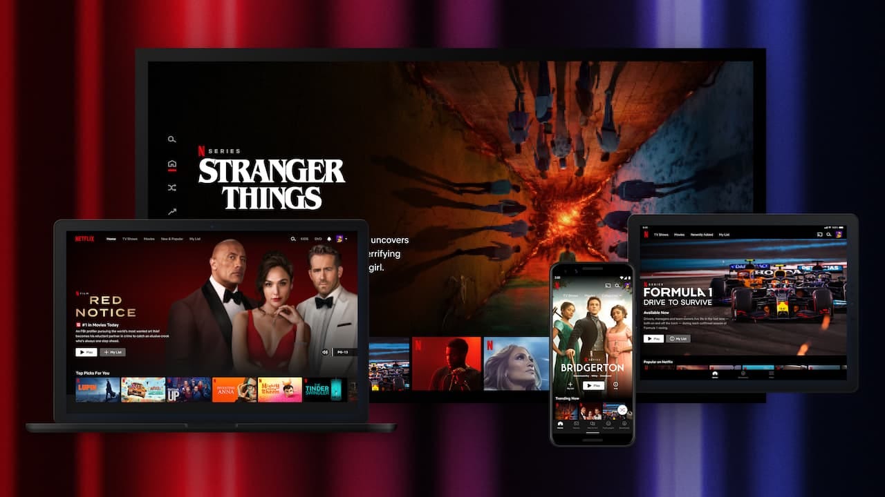
Netflix: As Netflix’s Designer, Navin Iyengar, reveals Netflix’s experimentation framework—it’s important for them to keep things consistent for users and not alienate them. Netflix product designers immerse themselves in people's homes and different countries to understand their lives and unmet needs, providing valuable insights for product development. Maintains a consistent watch and discovery experience throughout, making it easier for users to navigate and watch films. [Source]
Apple: Consistent design elements and interactions ensure a seamless user experience across all apps and the system.
#3 An experience that works for anyone.
Ideal for: Products used by both novice and experienced users. Good products accommodate beginners and power users—the experience will be almost similar from the first to the tenth time.
Examples
Trello: Allows users to customize their workflow and shortcuts, making it efficient for both new and power users.
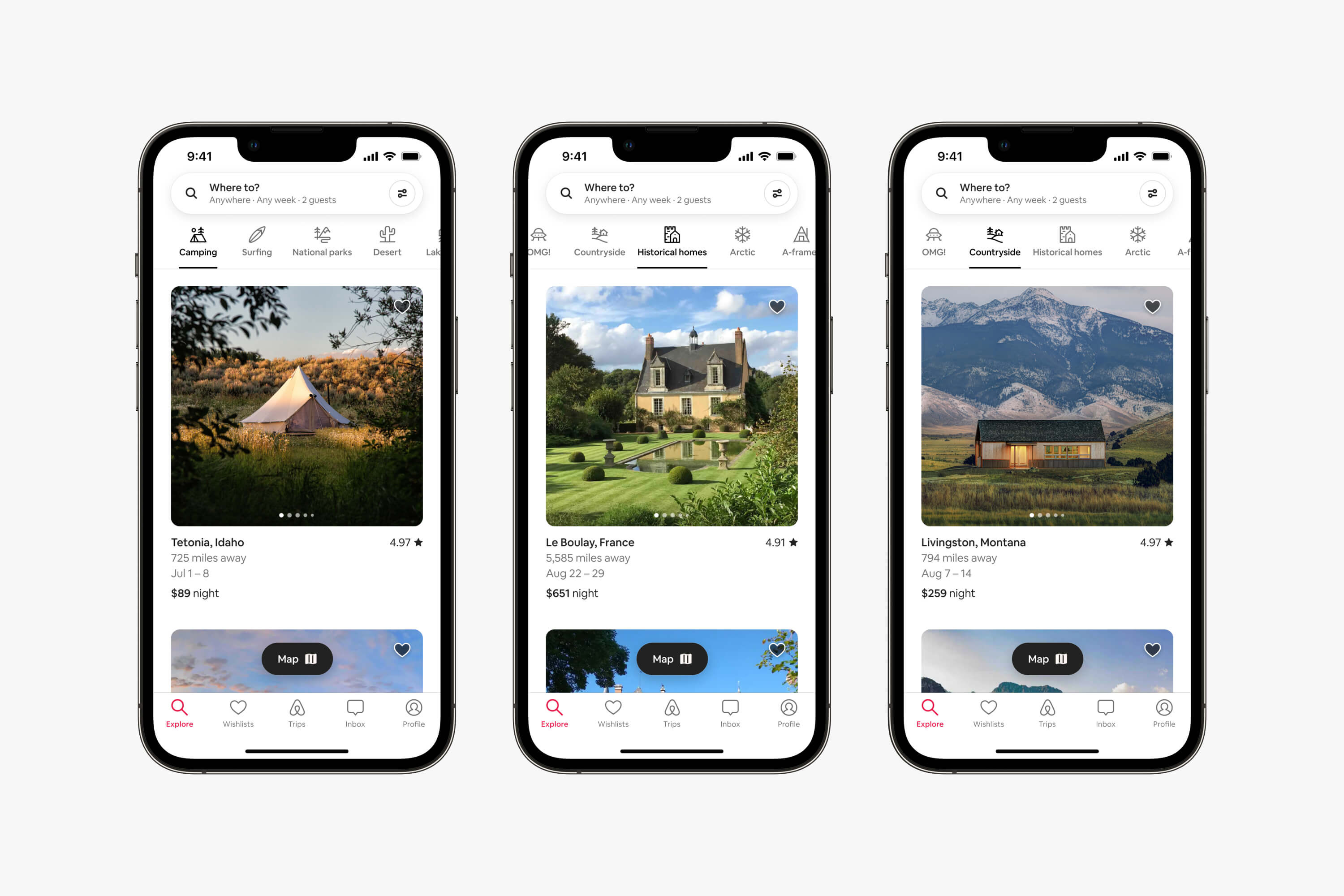
Airbnb: Alex Schleifer (Airbnb’s Former VP of Design) famously innovated everything from scratch all the way from each and every individual component and how they are built. “Here’s the simple truth: you can’t innovate on products without first innovating the way you build them.” From discovery to payments—Airbnb’s experience as a guest makes it so easy to use whether you are a first-time user or just browsing through many different categories. [Source]
Substack: Writing on Substack is extremely familiar whether you are a first-time writer or a pro writer; the experience works at every level.
#4 Help them recognize + recover from errors.
Ideal for: Products where errors might occur due to complex interactions or data entry. You want to provide clear, concise, and non-technical error messages that guide users toward resolving issues.
Examples
Grammarly: Former Grammarly’s Head of Design, Renn Valdes Olmos, said, “to make writing more readable and attention-grabbing”. The most popular writing assistant (I use it while writing this, too). [Source]
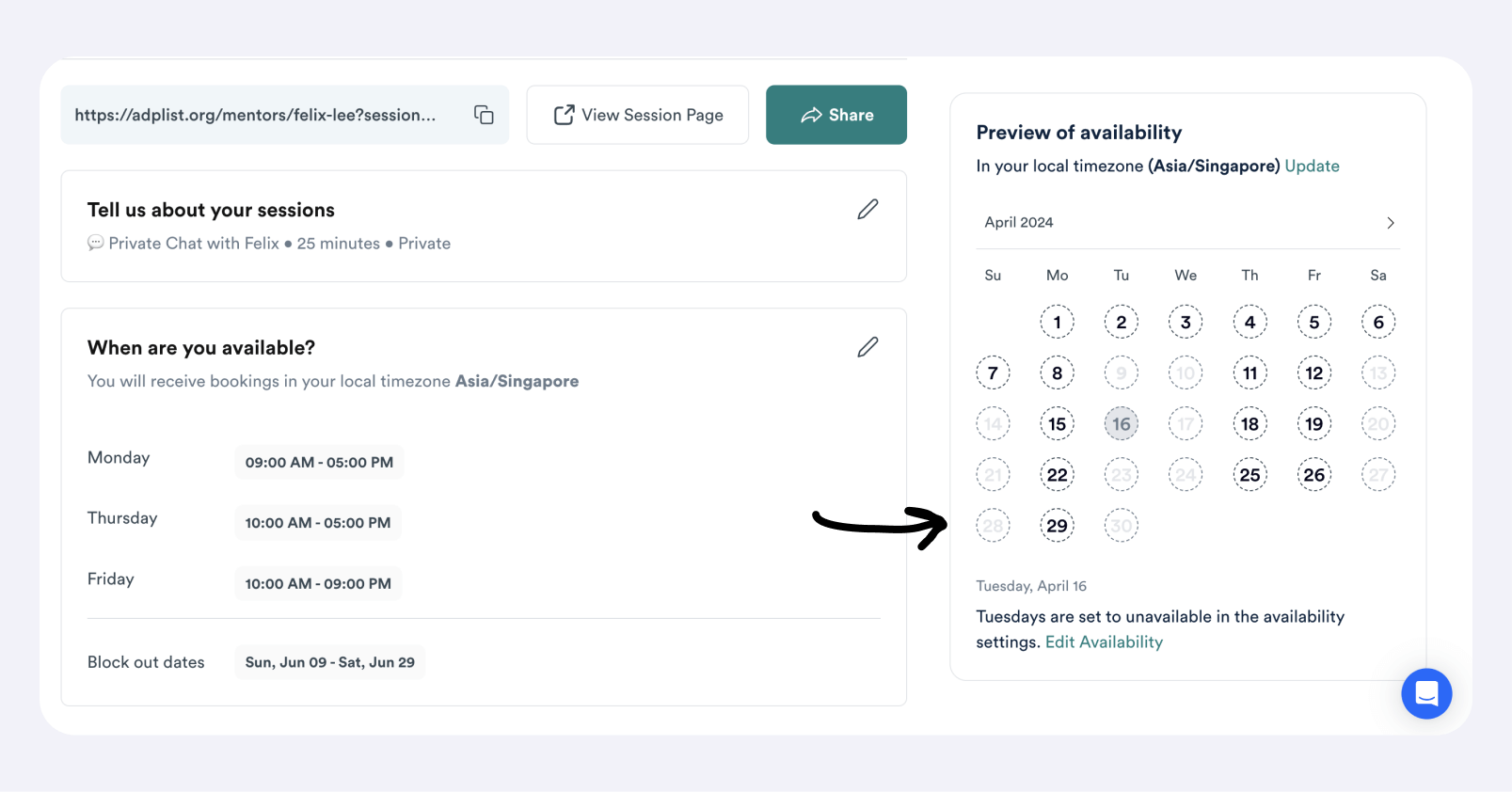
ADPList: When Mentors join, they set up their calendars, but knowing when you’re available can be complex. So we’ve developed a way for Mentors to self-troubleshoot, know why, and then recover.
#5 Tell them when things are working or not (have a plan).
Ideal for: Look, we’ve all been there. Users like to know when things are working and even when it’s not. This is practical for every use case, especially during onboarding and activation flows (booking, payments, etc).
Examples
Dropbox: As Joyce Shin (Design Ops Business Manager, Dropbox) said, “Fundamentally, design is all about people. It isn’t about “making things look pretty” or about fashion.” Provides real-time feedback on file upload progress and sync status, keeping users informed of the curr