Brilliant friction
Little-known secrets about friction in products like Duolingo, Headspace, Peloton and more.
Hi, I’m Felix! Welcome to this month’s ADPList’s Newsletter: ✨ free edition ✨ advice column. I write high-quality insights on designing products people love and leadership in tech. If you’re interested in sponsoring us, let’s chat!
🤯 Mind-blowing news—Chris Do is coming to ADPList’s Exclusive Fireside chat interview on Future of Creativity, on May 30th 👉 RSVP here.
If there’s one secret I learned at ADPList, it is the power of positive friction.
What is positive friction? Positive friction is adding effort to UX while at the same time, ensuring that friction gives back value.
This is why positive friction can seem counterintuitive. When in reality, it can really be extremely useful.
This week’s breakdown is on it!
——
🚨 Starting in 7 days, only paid subscribers will get this newsletter weekly. In addition, paid subscriber questions will be prioritized, plus they’ll get exclusive goodies. Free subscribers will now receive this newsletter only about once a month!
✨ You are eligible for 10% off for the first year as an early supporter of our ADPList mission and community globally—just $72, or $6/month ✨
The fallacy that everything must be simple.
You’ve certainly heard this before:
“No! We can’t add more questions to the onboarding flow. It will drop completion!”
As Don Norman already said, Apple screwed this up, bad.
For every negative friction, there are positives that can go long-term for the users.
——
1. Registration & Onboarding
Now, this is where PMs and designers get anxious because the drop-off at the top of the funnel can be very real. But nowhere do you see positive friction better than onboarding—the fintech and wellness apps are amongst the best at this.
The first example I want to share is Coinbase.
Coinbase’s onboarding is 60 steps!
Like many fintech apps, KYC is important for compliance and customer protection. Coinbase does this elegantly with a clear and predictable user experience. Only with this can people legally use the app.
Rise is an app in the wellness space that has an onboarding flow of 43 steps!
They realized the more screens they added to the onboarding flow, the more personalized and advanced their product appeared to the end users. People valued personalization more than the extra questions they had to answer.
This is considered a pretty normal scenario in the category.
2. Achieve goal with friction
What may shock you is—friction can be the entire selling point of your product (such a first-world problem)… let’s think along the lines of phone addiction.
Opal blocks off your favorite apps!
Opal helps people focus and curb their phone addiction by blocking off their apps until their set time is up. To make this experience valuable, they generate fun quotes whenever you try to go in!
PS. I’ve been a user of this and my average daily screen time went from 5.6 hours to only 3 hours.
This is friction at its best for user experience. (you can get a guest pass 👀)
3. Important decisions
Important decisions like deleting a file, leaving your information unsaved, or worse, sending an email that is supposed to have an attachment but is sent without. We’ve all been there.
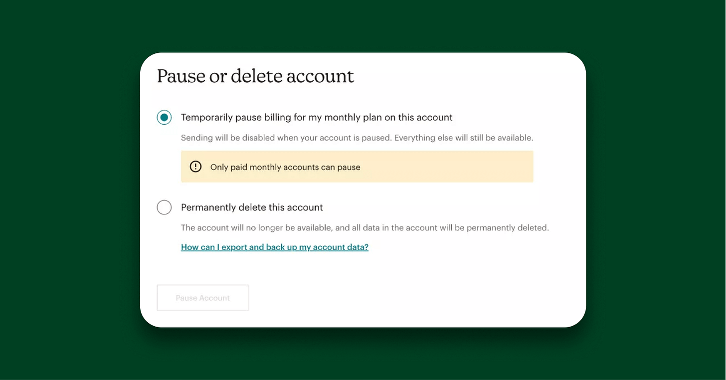
Mailchimp and Asana—churn saver!
Another type of good friction means delaying account cancellation (typically to share plan alternatives rather than allowing customers to churn). Asana offers a cheaper plan to users who want to cancel.
Saving users from one-way decisions.
Mistakes can be made.
Positive frictions like these can help users slow down to think about actions that can’t be reversed. It makes them more intentional and a better experience overall.
4. Purchase Flow
I find it surprising that positive friction often occurs in the purchasing experience. I thought that purchase flows, being sensitive and high stakes, would not be a good place to introduce friction.
As you already know, most consumer companies, even B2B companies, will have removed all friction to get someone to purchase as soon as possible, then offering even more choices.
First example is, MyFitnessPal, the fitness tracking app; which went from one choice and few copies to an entire explainer of the package.
The next example is Flighty, the flight tracking app. Flighty went from a one-click checkout experience to a clunky swiping view with all the different plans, features, and prices.
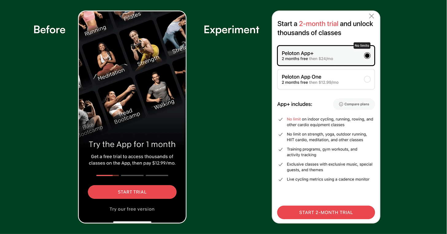
Finally, Peloton, the fitness-wellness app. They went from the novelty of UI and animation… to giving more descriptions and clearer offerings of different packaging. Sounds counterintuitive, but a friction that helps convince more people to start trial.
I hope you are now convinced that friction isn't always evil. When used appropriately, it is often a win-win for both users and the business.
Have a productive and fulfilling week! 🙏
Priceless ADPList community
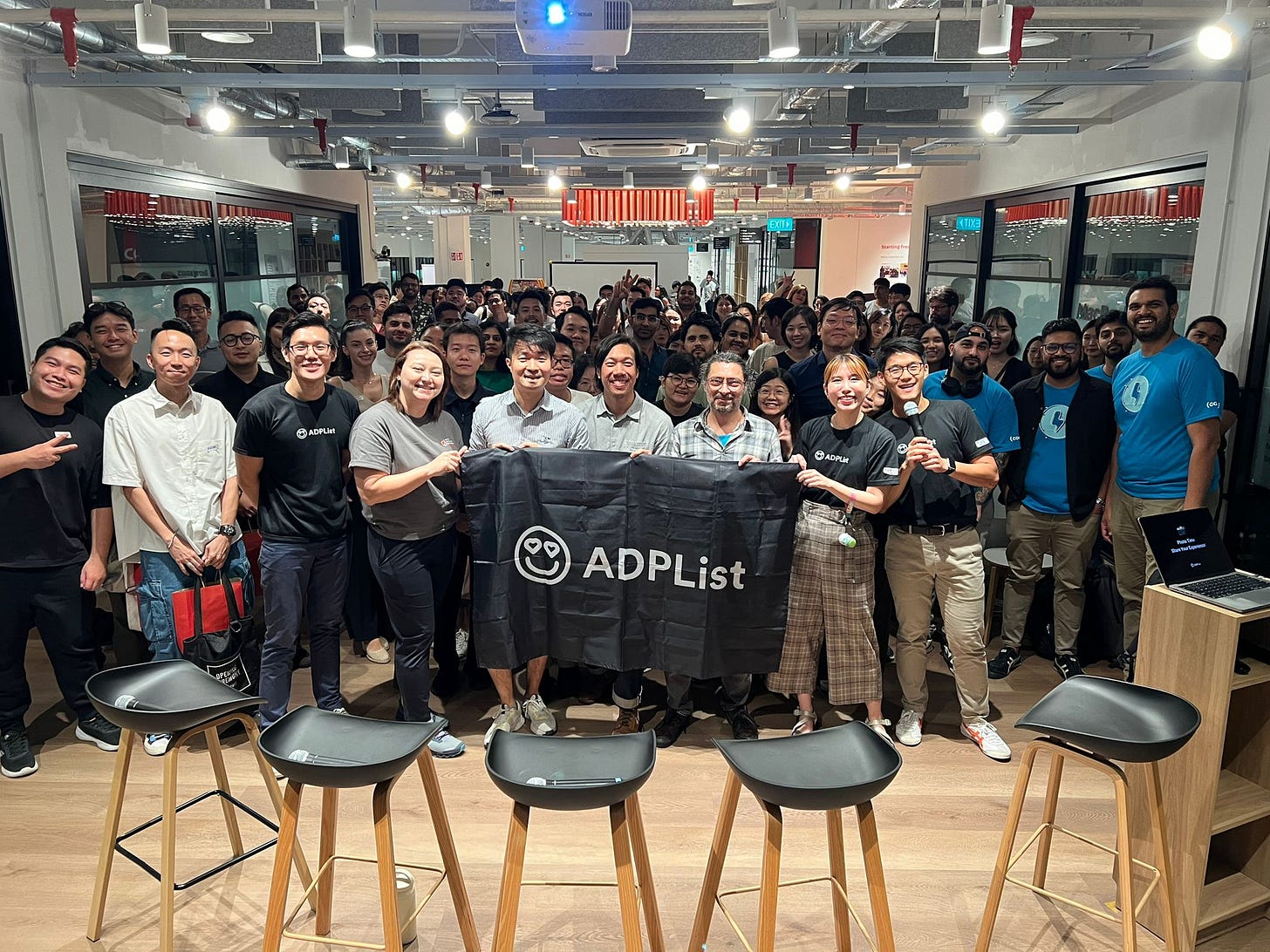
Last Friday, we hosted a 150 people ADPList Event in Singapore 🇸🇬 and we’ve got even more noteworthy community meetups and events near you (list below):
🇷🇴 Bucharest, May 18th: https://lu.ma/axakbz23
🇬🇧 Birmingham, May 18th: https://lu.ma/7hzrelpp
🇵🇹 Porto, May 18th: https://lu.ma/fumxyc93
🇬🇧 London, May 19th: https://lu.ma/x136bxc3
🇺🇸 Salt Lake City, May 22nd: https://lu.ma/1thlqyh1
🇺🇸 Phoenix, May 22nd: https://lu.ma/0ir37mjn
🇺🇸 Atlanta, May 23rd: https://lu.ma/h7e023n7
🇺🇸 San Diego, May 23rd: https://lu.ma/opgicylq
🇭🇰 Central Hong Kong, May 24th: https://lu.ma/7pygk9im
🇳🇬 Lagos, May 25th: https://lu.ma/fsjbbe9p
🇮🇳 Mumbai, May 25th: https://lu.ma/joa3l5xh
🇨🇦 Calgary, May 25th: https://lu.ma/pbc3w4vj
🇦🇺 Sydney, May 29th: https://lu.ma/5ei5qods by ADPList Sydney Chapter!
🇳🇱 Amsterdam, May 30th: https://lu.ma/hkydaz03 by ADPList Amsterdam Chapter!
👉 Can’t find your city? The deadline to submit your meetup request here. It only takes 10 minutes, and you'll meet awesome folks in our community!
I'll keep creating great stuff if you keep reading. I read every reply if you care to reply :). You might get an answer back.
Until next week.
Felix Lee


