How culture shapes UX: Western vs. Asian design
Why Asian UX feels so different — and what we can learn from each other.
Hey there! This is a 🔒 subscriber-only edition of ADPList’s newsletter 🔒 designed to make you a better designer and leader. Members get access to exceptional leaders' proven strategies, tactics, and wisdom.
For more: Get free 1:1 advisory | Become an ADPList Ambassador | Become a sponsor | Submit a guest post
Friends,
This edition is a deep dive into something we don’t talk about enough—how cultural differences shape digital experiences. The recent TikTok ban in the U.S. sent thousands of Western users to RedNote (小红书), a Chinese app with a denser, busier UI. By conventional Western UX standards, it should have been overwhelming. Instead? Users adapted.
So are we underestimating our own adaptability? And what can we learn from the way different cultures approach design?
Here’s what we’ll unpack in this edition:
Western vs. Asian UX: Why information density isn’t bad design
The psychology behind navigation, hierarchy & whitespace
What RedNote’s success reveals about the future of global UX
Let’s dive in 👇🏻
Kristina Volchek is a former CMO turned self-taught designer. After transitioning into freelancing in 2019, she spent three years designing and building Webflow websites and Shopify stores, helping small businesses thrive. In 2021, she joined Sweatcoin as a Senior Product Designer on the Growth Team, where her designs contributed to acquiring over 66M new users in just one year. Since 2022, Kristina has been teaching UI and Product Design at Dribbble, mentoring at Liftyz, and, in 2024, she returned to freelancing to empower content creators and solopreneurs while teaching at Growth Design School.
You can connect with her on (LinkedIn) & (Instagram)
After five years in Poland, I decided to fully embrace the digital nomad lifestyle. My partner and I sold, donated, or threw away most of our belongings and packed our lives into just two suitcases. We kicked things off with two months in Bangkok, Thailand (where I’m writing this from), and next up: Fukuoka, Japan, just in time for the Sakura season.
As I settle into life in Asia, I’ve been noticing cultural differences everywhere — not just in daily life, but in design. And in January, something particularly interesting happened: thousands of Western “TikTok refugees” found themselves on the Chinese app RedNote (小红书).
This unexpected migration got me thinking — how do Western and Asian design cultures differ? And where can we find common ground?
What the TikTok ban taught us about design & adaptability
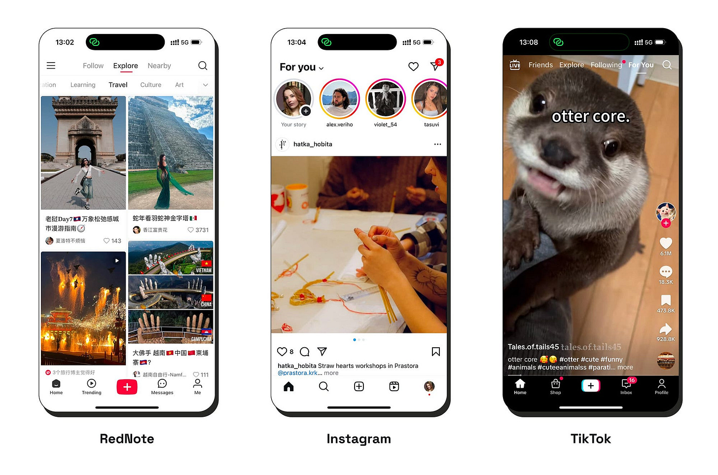
Last month, the temporary TikTok ban in the US sent thousands of users scrambling for alternatives. Some landed on Instagram Reels, others on YouTube Shorts — but a surprising number ended up somewhere completely different: RedNote (follow me there 😉), China’s Instagram-TikTok hybrid.
At first, it seemed like just a temporary switch. RedNote’s interface is busier, denser, and packs in more information upfront — quite a contrast to Instagram’s clean, photo-based simplicity. By Western UX standards, it should have felt overwhelming.
But something surprising happened: Western users adapted.
Despite cultural differences in design (and poor translation), many users figured out how to navigate the app, engage with its content, and even appreciate some of its design choices. This challenges a common assumption — that Western users inherently need minimalism to function efficiently in digital spaces. Instead, it turns out they’re more adaptable than expected — and maybe the way we think about “good UX” is more flexible than we thought.


