

Duolingo, Notion and Figma: How-to AI Design
Breaking down the playbooks of top AI-forward companies.


Hey there! This is a 🔒 subscriber-only edition of AI First Designer (by ADPList) 🔒, to help designers transition into successful AI-First builders. Members get access to proven strategies, frameworks, and playbooks. For more: Get free 1:1 mentorship | 🚀 Be first to win in career as an AI-First Designer (EARLY BIRD sale now)
Hi AI-first friends,
Most AI features today feel like an afterthought.
A button here, an “AI-powered” tag there, maybe even a shiny beta rollout. But that’s not enough to build trust — or adoption.
The truth is: designing for AI-first adoption is different. AI isn’t another backend upgrade or a new UI skin. It makes decisions, generates outputs, and actively changes how people think, learn, and create. That means the design rules are different, too.
And yet, very few teams share how they actually design for this shift.
So today, let’s break down three companies — Duolingo, Notion, and Figma — that are quietly writing the playbook on AI-first design. Each of them treats AI not as a gimmick, but as a core design partner.
Along the way, I’ll share the principles that explain why their AI adoption feels so natural while others stumble.
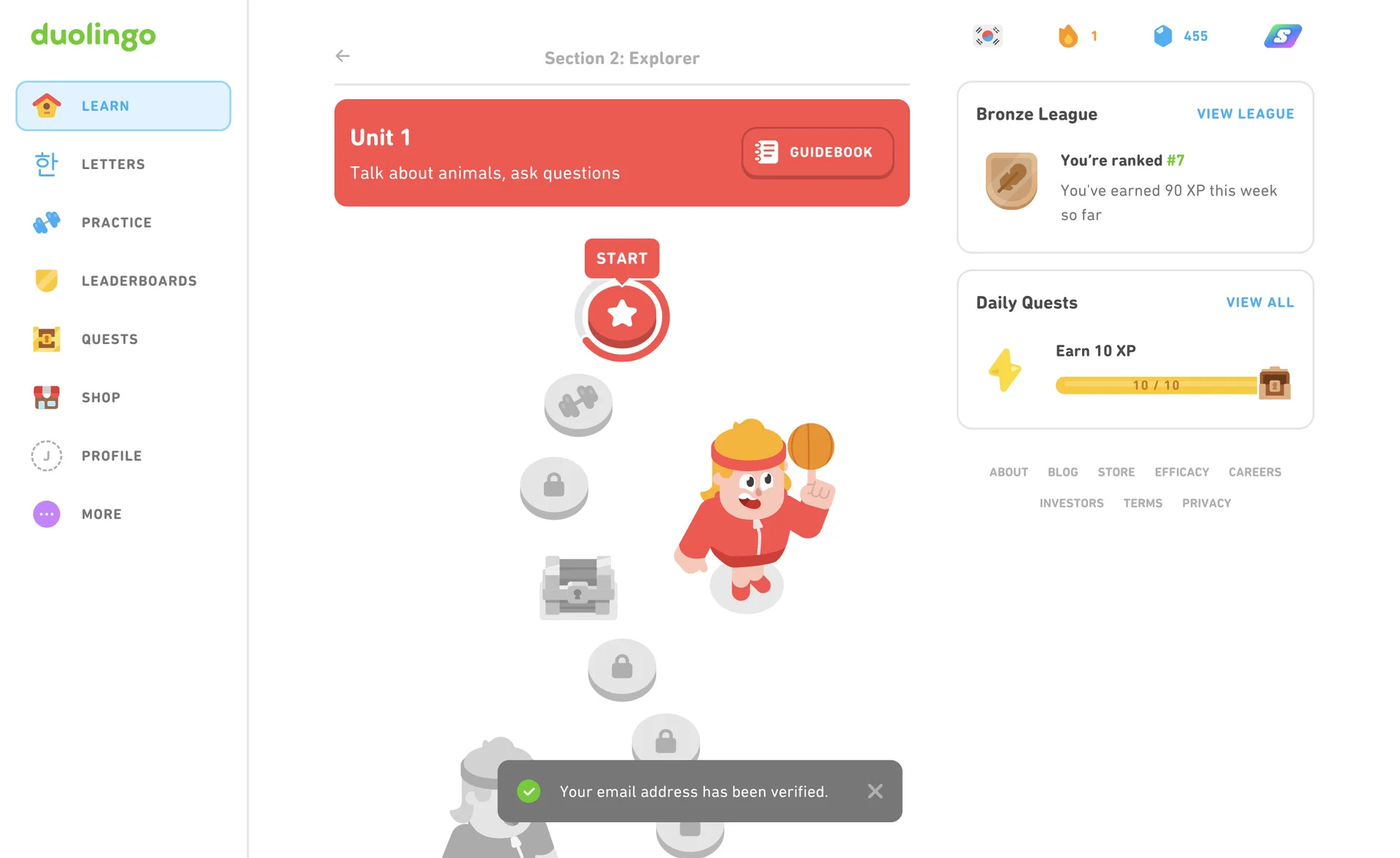
1. Duolingo — Designing AI for learning & engagement
Duolingo’s AI success isn’t about flashy model names or marketing blurbs. It’s about a design philosophy: AI should act like a patient coach, not a sterile engine. That shift changes every interaction — from the microcopy to the feedback loops to the way mistakes are surfaced.
✅ Co-pilot (reframing AI as a guide, not a replacement)
People learn when they feel agency. The moment a system starts doing the work for learners, engagement drops — not because the AI is bad, but because learning requires effort. Duolingo positions AI as a co-pilot: it selects examples, nudges at the right time, and offers corrections — but you still lift the cognitive weight.
Example: Instead of producing full translations or answers, the app gives sentence completions, multiple-choice hints, or “type the missing word” interactions. The AI suggests, the learner decides.
How to use it:
Offer suggestions, not final answers.
Provide quick ways to accept, reject, or edit AI output.
Never hide the “you did this” path — show what the user did to get to the result.
Failure mode: Auto-complete that simply replaces practice with passivity. Users will finish lessons faster — and forget sooner.
✅ Friction-as-Trust (small effort increases perceived value)
Paradox: removing all friction often makes AI feel suspicious or worthless. In learning, a little friction signals that the learner contributed. Duolingo weaponizes micro-friction — confirmation taps, retries, hints with costs — to create a felt sense of accomplishment.
Example: Asking a quick follow-up question before showing the “full solution” (e.g., “Want a hint?”) or requiring a single tap to reveal the translation. That tiny choice creates ownership.
How to use it:
Build lightweight commitment steps (one tap, a choice, a short question).
Use optional hints instead of immediate reveals.
Reward the act of trying (micro-affirmations, progress ticks).
Failure mode: Zero-input “answers for me” flows that feel like magic but erode trust and retention.
✅ Persona framing (friendly avatar, clear boundaries)
Duolingo’s mascot is disarming: fun, slightly cheeky, clearly not human. That’s deliberate. A persona gives the AI voice and personality while the “non-human” framing stops users from projecting unrealistic capabilities.
Example: Duo teases you about streaks, congratulates you on wins, and issues gentle reminders. It never claims deep empathy or medical-style authority.
How to use it:
Design a consistent voice and persona — playful, stern, encouraging, whatever suits brand and use-case.
Explicitly set boundaries in copy (e.g., “I’m an assistant, not a teacher”).
Avoid humanized claims like “I understand you” or “I feel” which invite over-expectation.
Failure mode: Over-humanized bots that users treat like people — then punish them when they fail (see Microsoft’s Tay example). Persona without boundary = expectations mismatch.
✅ Progressive mastery (scaffold complexity over time)
Learning systems succeed when difficulty ramps in digestible steps. The AI should adapt not just to right/wrong answers but to how a user makes mistakes. That means designing for progressive mastery, where tasks evolve as competence grows.
Example: If a learner repeatedly mistakes past tense er verbs, the AI surfaces micro-lessons focused on that pattern and keeps other difficulties steady.
How to use it:
Track error patterns, not just scores.
Surface targeted mini-exercises for recurring errors.
Avoid one-size-fits-all increases in difficulty — personalize pacing.
Failure mode: Sudden jumps in difficulty or irrelevant repetition that frustrates users or creates boredom.
✅ Nudge loop (timing + tiny reminders beat heavy notifications)
Duolingo’s engagement is part product design, part behavioral science. Nudges — a succinct daily reminder, a “you’re almost there” banner — are timed carefully to avoid fatigue. The AI should personalize nudge cadence based on past behavior, not spray generic notifications.
Example: If someone usually trains at 7pm, nudge around that time. If they ignore three days, shift content to a softer, lower-friction task to re-engage.
How to use it:
Learn preferred times and friction tolerance per user.
Offer a lower-stakes re-entry (3-minute review) after absence.
Use micro-goals to rebuild momentum (today’s 1-minute streak).
Failure mode: Generic, high-frequency pushes that cause users to mute or uninstall.
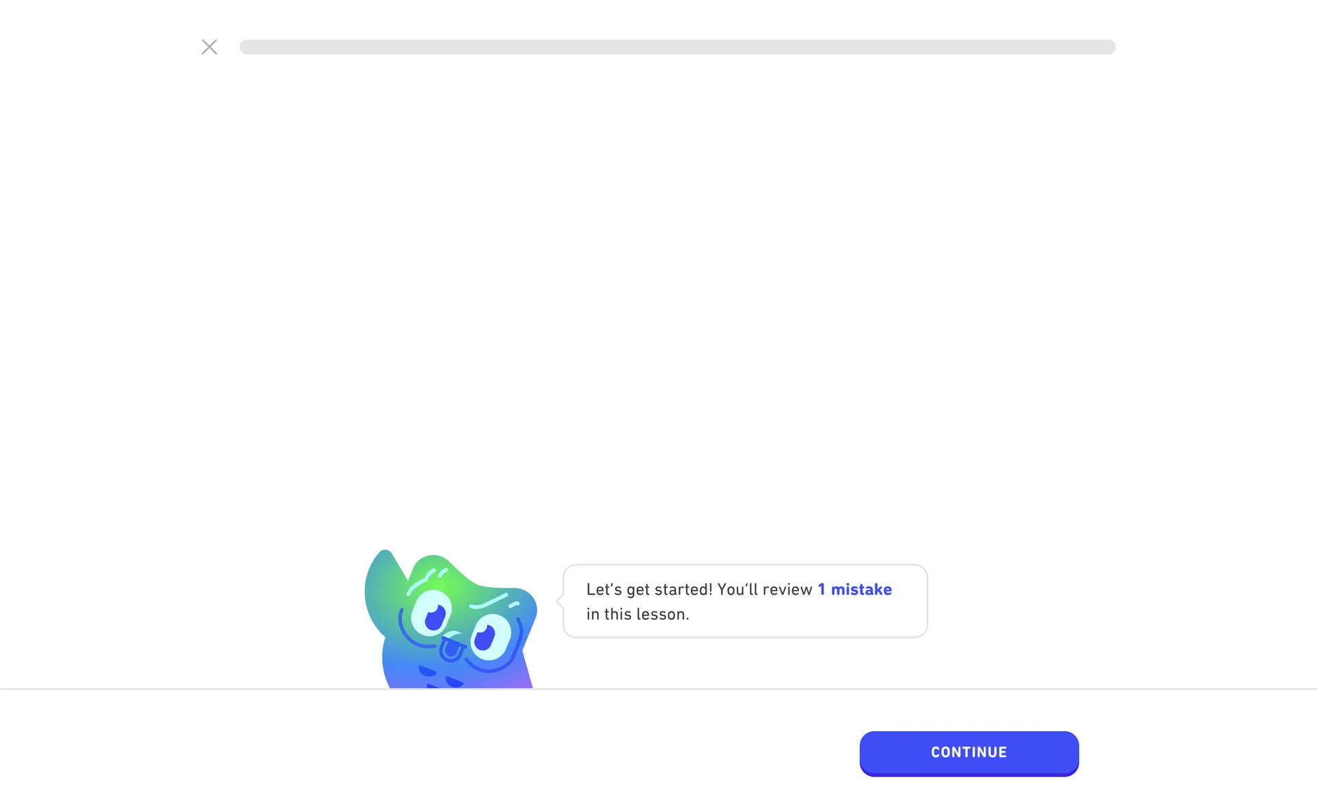
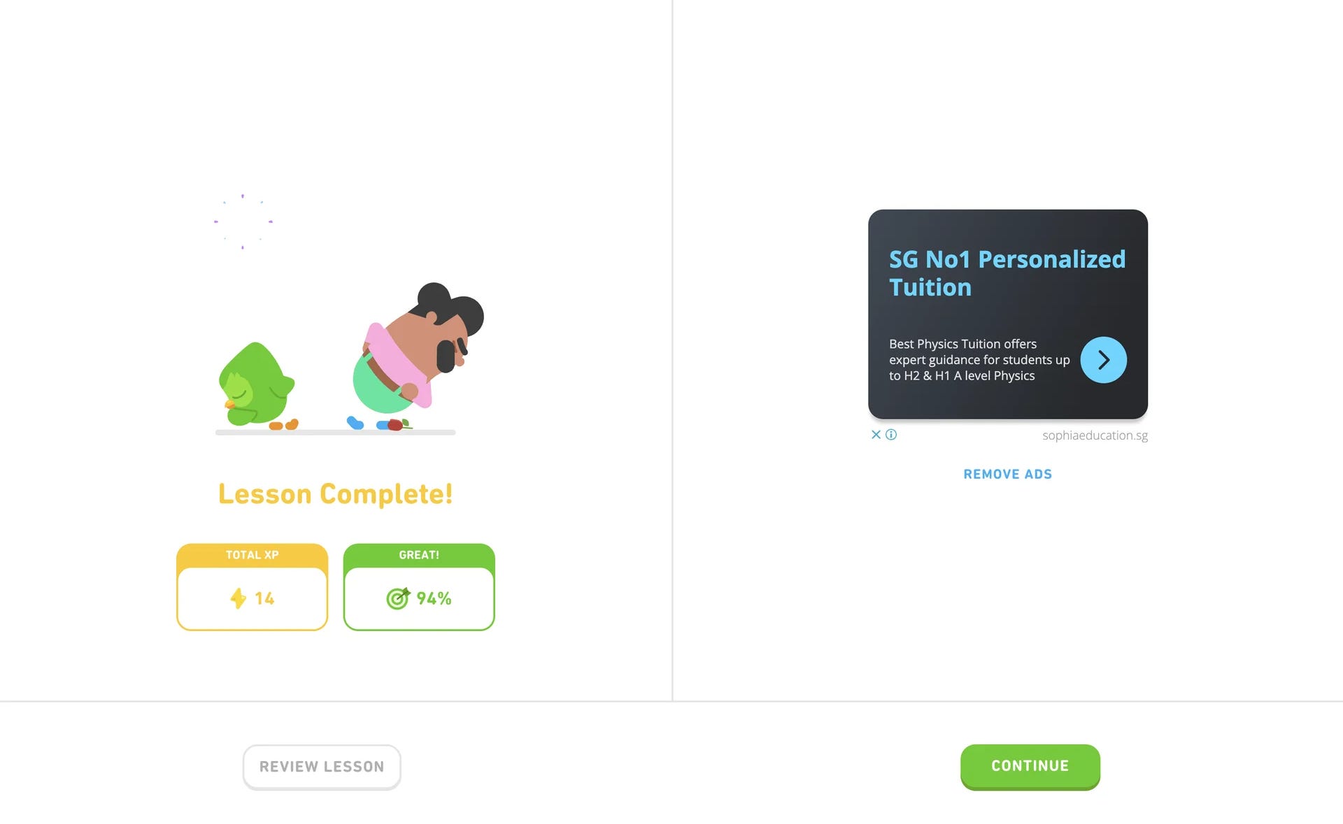
✅ Micro-feedback (immediate, contextual correction beats delayed reporting)
In learning, feedback must be immediate and contextual. The AI should explain what was wrong and why — in short, actionable snippets. This is how knowledge anchors: the explanation, the example, the quick attempt.
Example: After a wrong answer, show a one-line explanation and a 10-second micro-exercise targeting that exact error.
How to use it:
Keep corrections localized and short.
Offer one follow-up micro-task within the same flow.
Provide a quick “why” tooltip the user can open/close.
Failure mode: Bulk feedback after a session or vague “wrong/well done” labels that don’t teach.
📌 Design patterns Duolingo-style (practical, copyable UI choices)
Editable suggestions: When AI predicts a word or sentence, show it as a choice the user can edit before accepting.
Confidence hints: If the AI is uncertain, display phrases like “likely” or “common translation” rather than absolute claims.
Micro-undo: One-tap undo for recent answers to reduce fear of experimenting.