How Duolingo pushes users from freemium to premium
5 product-monetization lessons from the world’s most downloaded education app
👋 Hello, I’m Felix! Welcome to this week’s ADPList’s Newsletter; 🔒 subscriber-only edition 🔒weekly advice column. Each week, we tackle design, building products, and accelerating careers. If you’re interested in sponsoring this fast-growing community, let’s chat!
Duolingo has a huge 15.2 million reviews on the Play Store and 2 million on the App Store, with 4.5 and 4.7 stars, respectively. It is by far the biggest learning app in the world.
But the story wasn’t always so dreamy…
This week, we’re going to share a product breakdown of Duolingo’s monetization design. I’ve again invited Rosie Hoggmascall (Former Product Growth Lead at Peanut and a Top Testing Influencer in 2023) as I consistently get impressed by how she breaks down products. Many already look to Duolingo for inspiration, including at ADPList, and I suspect this story will only increase that trend. Enjoy!
Follow Rosie Hoggmascall on LinkedIn and Medium.
🚨 You can meet Don Norman & Vitaly Friedman on ADPList: Early-bird registration opens today!
Join us for this series of rare interviews with top design and product leaders, including Jakob Nielsen and Julie Zhuo, to advance your career.
Fireside with Vitaly Friedman (Founder & Editor-in-chief, Smashing Magazine). 🗓️ On Feb 28th → Register your seat today
Fireside with Ruben Cespedes (Principal Product Designer, Dell, 145K+ Instagram followers). 🗓️ On March 13th → Register your seat today
Fireside with Don Norman (Co-founder & Principal Emeritus, Nielsen Norman Group). 🗓️ On March 18th → Register your seat today
5 monetization lessons from the world’s most downloaded education app
Back in 2018, Duolingo was seeing single-digit daily active user growth year-over-year, according to ex-Chief Product Officer, Jorge Mazal. Growth was slow, people were getting pissed at losing their streaks, and it wasn’t looking good…
Fast forward to Duo’s 2021 IPO, and DAU has skyrocketed 4.5X since 2017. Shares closed 36% up on their first day of trading — valuing the company at a huge $5 billion.
Now, in 2023, Duo’s growth spurt continues. The Co-Founder and CEO reported a 47% increase in revenue year over year, with $100.3 million in subscription purchases.
**Dollar signs in eyes** 👀💰
A few weeks after reading Duo’s case study in
I was sitting next to my sister when she got a push notification from the app itself. She’s been learning French for 3 weeks (having not touched the language since school, desolée).I wanted to see Duo’s monetization and gamification in action — to untangle the web of monetization meets gamification meets education. So, I stole her phone (with her permission), and had a play around.
What I found was 5 monetization insights from the freemium user experience. We’ll go through them one by one and see how Duolingo drives users to pay through UX flows, reverse trials, multiple entry points, and leaning into the learner psychology of Self Determination Theory.
On y va 🥖
Lesson 1: Don’t just ask once. Ask many times.
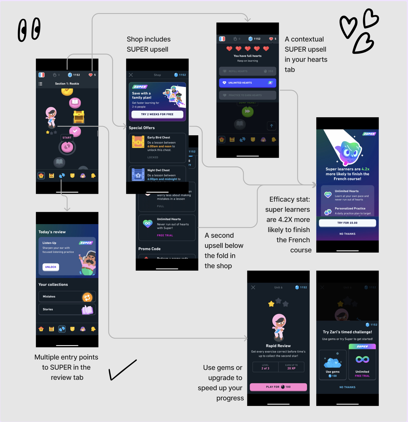
Pretty much everything you do in the app links to premium. The app architecture is full, both in the header and main navigation.
This is possibly the biggest, worst-kept secret of monetization UX. Ask, ask, and ask again.
If you only ask users to pay once, you’re leaving money on the table.
In Duo’s case, users are prompted to upgrade to SUPER:
In the shop (twice)
When viewing hearts
On the homepage, characters
In the review tab (twice)
After a lesson when watching an advertisement (more on this later)
That’s at least seven touchpoints in one user session if someone is playing around for the first time. And if they come back to do another lesson? They’ll see a few more.
You don’t get to 4.2 million paying subscribers by asking once.
→ Key takeaway: ask users multiple times if they’d like to upgrade. But don’t litter the app with it, think about where it makes sense.
Next, make it contextual.
Lesson 2: Make your paywalls relevant
So there I was, tapping around in Duolingo. I’d seen the same paywall countless times. But then I noticed something… it wasn’t exactly the same paywall.
Duolingo actually changes the first feature bullet point on the paywall to match where you entered the paywall from.
This is a nice touch and relatively easy in terms of effort.
However, I didn’t notice it…
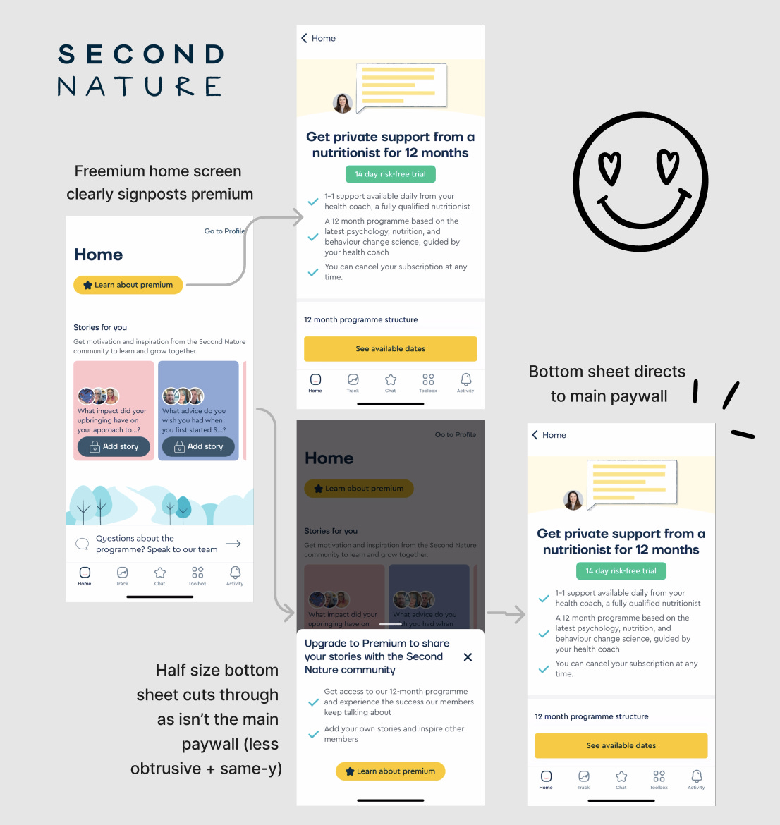
For me, this would be stronger if the massive purple paywall changed significantly from each area to cut through. I get they have strong premium branding, but users scan, so you need to avoid banner blindness by changing it up sometimes, as Second Nature does below.
You don’t necessarily have to add more friction to get users to a contextual paywall, but it could be worth it if you add enough motivation there.
Lesson 3: Reverse free trial for early power users
Now, this was new to me in a B2C app.


