

How I created beautiful UI with ChatGPT 4o
A tldr guide to this new powerful image generator.

Hey there! This is a 🔒 subscriber-only edition of ADPList’s newsletter 🔒 designed to make you a better designer and leader. Members get access to exceptional leaders' proven strategies, tactics, and wisdom. For more: Get free 1:1 advisory | Become an ADPList Ambassador | Become a sponsor | Submit a guest post
This newsletter is brought to you by Genway AI. Genway AI is a Research Platform powered by Conversational AI Agents. We help product researchers save 300+ hours and scale product research through natural, AI-moderated interviews - no scheduling, no staffing - just fast, actionable product insights.

Friends,
You’ve probably seen the viral Ghibli-style AI art flooding your feed lately. But while everyone was busy turning selfies into animations, Xinran took a different route—he wanted to see if ChatGPT could finally design something useful.
A few months ago, the idea of generating real UI mockups inside ChatGPT felt like a fantasy. The outputs were clunky, cartoonish, and nowhere near usable for product designers.
But then came GPT-4o.
With its latest update, OpenAI claimed better visual generation, text rendering, and contextual accuracy. So he decided to run a few experiments—and what he found completely changed my perception.
In this edition, he’s walking you through the prompts he used, what worked (and what didn’t), how you can generate usable UI visuals, and how far this tech has come in just a few months.
Here’s what we’ll explore:
Prompting ChatGPT to create detailed UI designs
From mockups to Figma: Testing real design workflows
What works better now—and where things still fall apart
Bonus: Three design variations created instantly
Plus a surprise quiz hiding in one of the images
If you’re a designer, builder, or just curious about what’s next for AI and design—this one’s for you.
Let’s dive in 👇🏻
Xinran Ma is the founder and author of Design with AI (designwithai.co), speaker, and award-winning designer. Design with AI (designwithai.co) is one of the fastest-growing AI newsletter and community—gaining over 2,000 new subscribers every month, from companies like Google, Amazon, Microsoft, and McKinsey. He is also the author of multiple Amazon #1 New Release books in UX and the instructor of a featured AI course on Maven: AI for Product Designers. He regularly delivers lectures and conducts AI workshops at places such as Microsoft, Columbia Business School, UXPA, University of Connecticut, and Pratt Institute.
Newsletter: https://designwithai.co/
Books: https://xinranma.gumroad.com/
Prompts, walkthroughs, and surprises
🤯 Over 2,000 people subscribed to Design with AI newsletter over the past 30 days, where this article was originally published. Grateful for your support.
Is it even possible for ChatGPT to generate UI?
I tested that several times before, but the results were very disappointing.
Below is an example I shared in a newsletter two months ago.
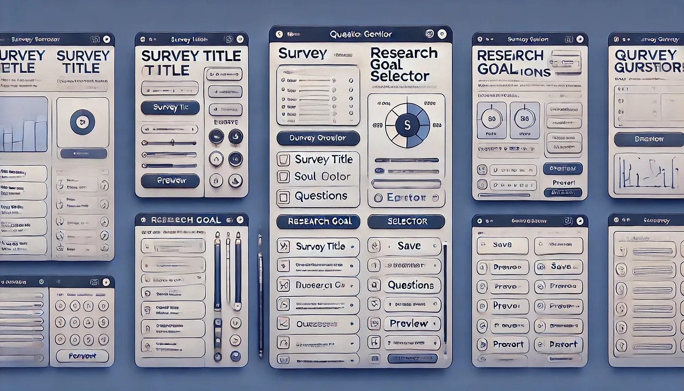
It looked too cartoonish to be usable.
However, last week, OpenAI rolled out a major update, so I decided to try it again.
I was able to generate much better UI mockups based on my prompts. I could even create multiple design options for my needs:
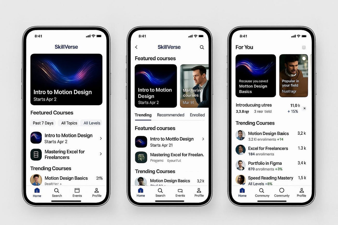
Today, I’ll show you the experiments I ran, the prompts I used, and some surprises and takeaways along the way.
Let’s dive in.
The Context
OpenAI announced that you can now generate high-quality images in ChatGPT using GPT-4o, instead of the older DALL·E model.
It’s better at following directions and does a better job rendering text in images.
Many people tried it out last week to turn photos into AI art — which is why the Ghibli-style art trend went viral.
I tried it too:
But after seeing many interesting arts online, I thought:
What if I could use ChatGPT to generate UI that’s actually useful for a product designer?
That’s where the experiments began.
The Experiments
1. Create a detailed prompt
I used ChatGPT to help me generate a detailed prompt for the UI I wanted.
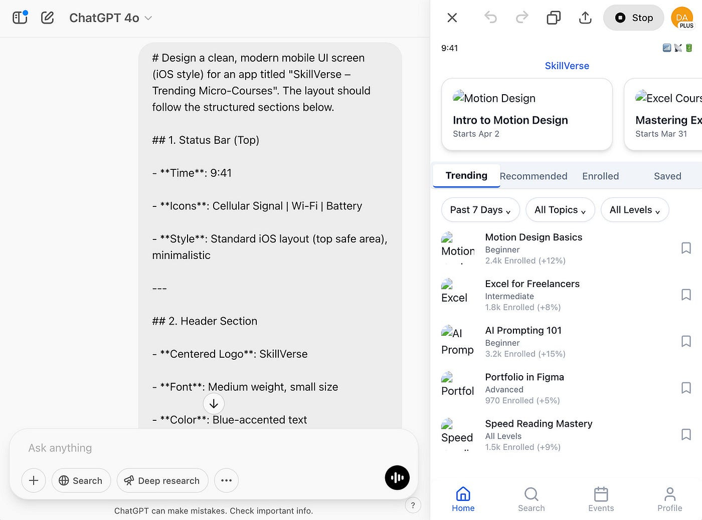
# Design a clean, modern mobile UI screen (iOS style) for an app titled "SkillVerse – Trending Micro-Courses". The layout should follow the structured sections below.

## 1. Status Bar (Top)
- **Style**: Standard iOS layout (top safe area)
---

## 2. Header Section
- **Centered Logo**: `SkillVerse`
- **Font**: Medium weight, small size
- **Color**: Blue text
---

## 3. Featured Courses Carousel (Horizontally Scrollable)
- **Style**: Swipeable cards with rounded corners and soft shadow
- **Cards**:
    - **Card 1**
      - Title: **Intro to Motion Design**
      - Subtitle: *Starts Apr 2*
      - Visual: Animation thumbnail
     - **Card 2**
      - Title: **Mastering Excel for Freelancers**
      - Subtitle: *Starts Mar 31*
      - Visual: Productivity icon
---

## 4. Navigation Tabs
- **Tabs**:
    - **Trending** (Active, **bold label** with **blue underline**)
    - Recommended
    - Enrolled
    - Saved
---

## 5. Filter Row
- **Filters (Dropdowns)**:
    - **Past 7 Days** (Time-based)
    - **All Topics** (Category)
    - **All Levels** (Difficulty)
---

## 6. Trending Courses List
- **Layout**: Vertical stack of repeatable course items:
    - **Left**: Rounded thumbnail
    - **Center**:
    - Course Title
    - Level (e.g., Beginner, Intermediate, etc.)
    - **Right**: Save Icon
    - **Bottom**: Enrollment count + trend (e.g., 2.4k Enrolled, +12%)   ---

## 7. Bottom Navigation Bar
- **Tabs**:
  - **Home** (Active, highlighted color)
  - Search
  - Events
  - Profile
  - **Style**:
  - Labels underneath
Then I pasted it into a new chat window in ChatGPT and clicked the “Generate” icon.
2. A code-backed UI generated
Surprisingly, ChatGPT opened an extra panel on the right, triggering its Canvas feature. Then it started generating code.
This immediately reminded me of Claude’s Artifact feature.
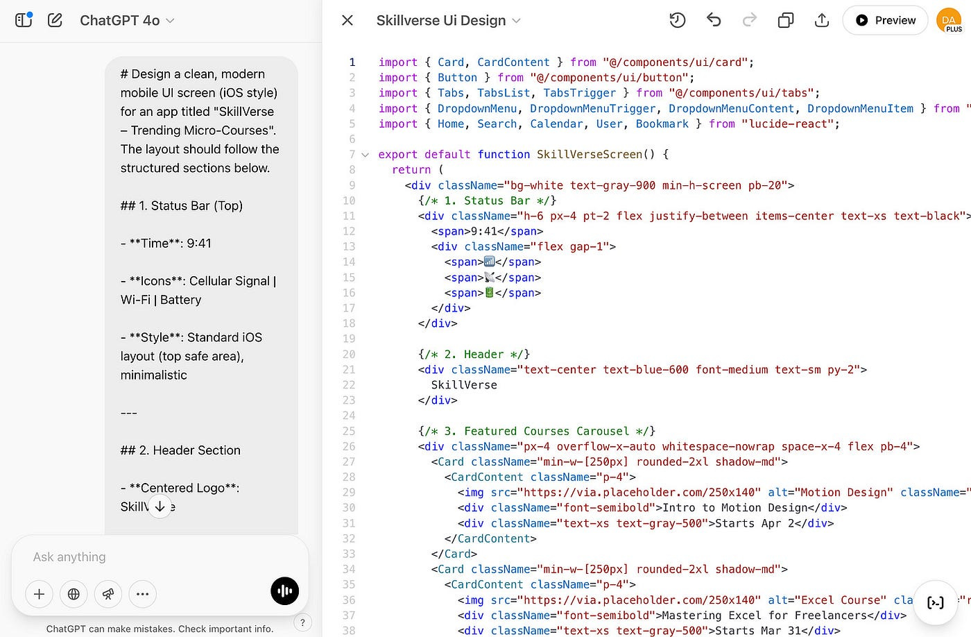
Then I clicked the “Preview” button in the top-right corner.
A responsive, code-backed UI was generated.
It was delightful to watch, but also seemed less precise/polished than Claude.
3. Ask for a visual mockup instead
Since my intent was simply to generate an image (a visual mockup) rather than a code-backed UI, I asked a follow-up prompt to correct it:
 | A guest post by
|