👋 Hello! Welcome to this week’s ADPList’s Newsletter; 🔒 subscriber-only edition 🔒weekly advice column. Each Tuesday, we tackle design, building products, and accelerating careers. We’re looking for sponsors! If you’re interested in sponsoring our newsletter, let’s chat.
This week, we’re going to 🔒 share exclusive insight 🔒 on, Tinder.
I have been following Rosie Hoggmascall (Former Product Growth Lead at Peanut and a Top Testing Influencer in 2023), and she shared her observation of how Tinder was growing with design and monetizing. I was captivated by a design like this — where it’s driven by small design changes, rooted in growth models, and explained in such actionable detail. I asked Rosie if I could feature her original article and deep dive into Tinder — thankfully, she agreed! Many products already look to Tinder for inspiration, and I suspect this story will only increase that trend. Enjoy!
Follow Rosie Hoggmascall on LinkedIn and Medium.
Get your work organized & productive with the exclusive Notion x ADPList series
We’re partnering with Notion to help you become more productive and organized. This is a 100% free series in November that will boost your career!
This is the most popular dating app in history
Tinder generated over $1.6 billion in revenue in 2021, 17% up from the year before. What’s mind-blowing is that it is only the 5th most lucrative dating app out there…
Despite being a number 5 😉, with 75 million monthly active users and 9.6 million subscribers (as of 2021), there’s a huge amount to learn from Tinder when it comes to monetization, UX, pricing, and user segmentation.
I’ll cover each one-by-one below and uncover how Tinder manages to design for monetize so well.
1. Tinder’s early UX flow: activation over monetization
Similar to Bumble, Tinder allows users to experience core functionality before pushing them to pay. I’m able to journey through onboarding and swipe on some profiles before any paywalls.

The reason for this is that you don’t want to stop users from reaching the magic moment. Pushing monetization too hard for a product with a good freemium experience risks churning users too early.
This is especially important for dating product where a large proportion of freemium users are people who will have success no matter what: i.e. young, single, attractive women.
According to Andrew Chen, due to the nature of Tinder’s network effects, the ‘hard’ side of the network (young, attractive women) is in high demand by the ‘soft’ side of the network (men), and therefore women find it easier to match.
2. Power of Personalization: segment your user base
In Lenny’s Podcast, ex-CPO at Tinder, Ravi Mehta explained that Tinder’s monetization strategy has two key components:
Subscription
One-off payments
Within the subscription, there are three tiers (and counting). This is a similar model used by other dating apps like Bumble. The reason this model increases revenue is that it is personalized to different user’s willingness to pay.
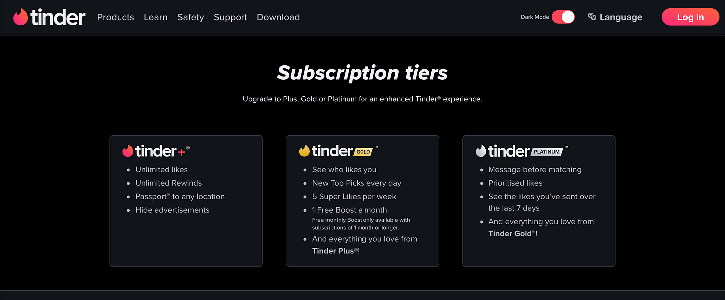
Tinder has three subscription products: Tinder Plus, Tinder Gold, and Tinder Platinum.

What’s interesting is when I learn about each of these in the user experience.
I had no idea there was such a thing as Tinder Platinum for weeks. I can’t even see Platinum on the list of in-app purchases on Tinder’s app store listing.
Whereas, Gold and Plus are promoted to new users in their first session.
I saw Gold first, as I tapped on the see waves tab. Seeing waves is the main value proposition of the subscription and the reason why the majority of subscribers pay. Hence it makes sense to drive to their medium-expensive tier instead of the cheaper tier — to avoid missing out on $$$.

I then saw Plus, Gold, and a one-off payment from the profile cards themselves:
Try as hard as I might, I just couldn’t find Platinum. I tried for a grand total of 10 minutes before asking a friend or two with a lot more experience on Tinder than me (thanks goes to Izzy & Alex).
Tinder Platinum is nestled in the Likes Sent tab. Why? My guess would be that this is a tab where power users go. Power users who aren’t getting responses to their likes, and go searching around in the app.
What is very snazzy, is that once you see the payment screen, you’re put onto a CRM flow. My unfortunate friend now receives Platinum-related pushes:
The first push 5–10 minutes after exiting the app and not purchasing Platinum
4 hours later in the evening, another Platinum push
I’m a huge fan of personalized push — don’t just send everything to everyone (or else you kill that channel). Apparently, advanced targeting improves push engagement by as much as 300% and personalization by up to a huge 400%.
With both push notifications and payment tiers, Tinder hides complexity for new users. The key idea is to avoid bombarding users early on and causing churn.
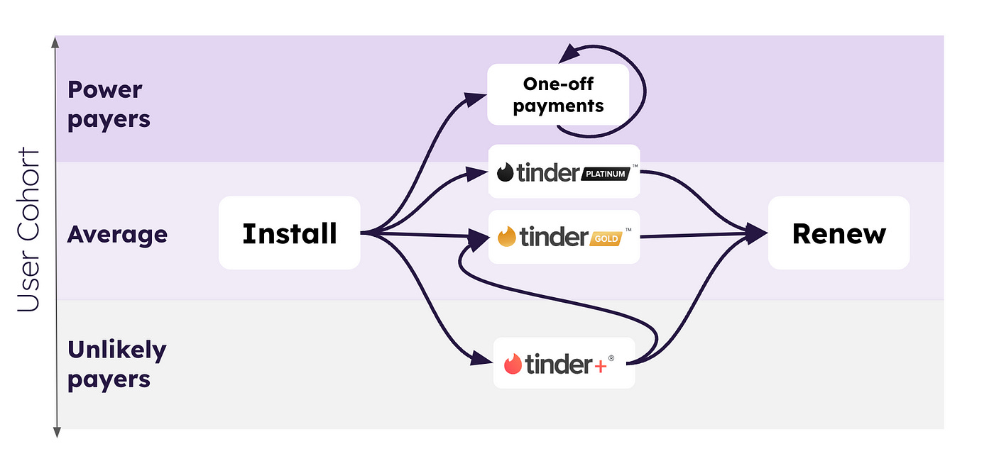
Now that we have visibility over all their tiers and where they’re promoted in the UX flow, let’s draw it some UX flows. Here’s a basic monetization flow with some user cohorts drawn on from most willing to pay (top) to least willing to pay (bottom):
With only one tier, you’re catering to one of many cohorts. By adding more tiers, you’re catering to multiple willingness to pay price points:
Tinder Platinum caters to people who want to get a date ASAP and will pay to do so (crucially, they want their likes prioritized). Tinder+ caters to the more price-sensitive users who don’t want to pay for GOLD.
It doesn’t stop there with segmentation, next, we look at how Tinder drives even more revenue from power payers with one-off payments.
3. All-in into your super users
Segmentation is not the only thing that drives Tinder’s huge revenue numbers. According to Ravi Mehta, Ex-CPO at Tinder, one-off payments were a huge shift in Tinder’s monetization strategy, driving a disproportional amount of revenue from a small percentage of users (<10%).
Through research, the product team at Tinder found that some users were buying a huge amount of boosts and super likes. When the team drilled into this insight, they found that this small cohort of users had a surprising difference in average revenue per user per month (ARPU):
Named the ‘Whale’ users, this cohort displayed 10X ARPU compared to average (a monthly payment of $300 vs. $30).
When the team dug into why, they found that these people were often mobile; they moved around a lot (think sales people and people in the army). Therefore, they were happy to throw money at Tinder to get them a date ASAP when they were located in a new area.
Adding that into the UX flow, you can see that Tinder’s monetization strategy leans into segmentation even further by offering one-off payments that help power users get to the magic moment over and over again.
It’s useful to think of monetization as being broken into a few key levers:
Tinder drives revenue by moving not just average revenue per user (having higher pricing tiers and one-off payments), but also conversion to payer (lower payment tiers).
Takeaways from Tinder’s design
Don’t bombard users with monetization too early. Especially if you’re a network, and the people attracting others are unlikely to pay — you risk killing your network (i.e. a negative network effect).
Don’t assume if users don’t pay, they never will. Similarly, don’t assume users paying won’t pay more. By offering more tiers, you’re catering to more price-sensitive cohorts, as well as power payers.
Go even further with segmentation; what would the power payers pay more for? What can you offer the non-payers that may make them pay?
Convincing monetization looks like:
Research, research on the hidden behavioral insights
Design and offer multiple tiers of monetization (choices)
Work closely with data to learn behaviors and design to test fast
That’s it for this week! You can follow Rosie for more on LinkedIn or Medium. Hit me up if you have any stories, or insights to share. Have a productive & fun week! 🙏
ADPList is on a mission to fulfill every person’s potential - by opening doors to mentors worldwide. Join over 200K+ learners and meet your mentor today.
If you find this newsletter valuable, share it with a friend, and consider subscribing if you haven’t already. There are Referral Bonus available for our community.
Sincerely,
Felix 💙


Wonderful insights, explained so simply:)
Keep up the great work!