How to design clear AI interactions
AI transparency in UX. Users need more than a sparkle icon and chat-bot to designate embedded AI.
Hey there! This is a 🔒 subscriber-only edition of ADPList’s newsletter 🔒 designed to make you a better designer and leader. Members get access to exceptional leaders' proven strategies, tactics, and wisdom. For more: Get free 1:1 advisory | Become an ADPList Ambassador | Become a sponsor | Submit a guest post
This newsletter is brought to you by Outlier. Want to break into AI while sharpening your coding skills? Now’s your chance! Outlier offers a *flexible, remote, and paid* opportunity to collaborate with cutting-edge AI models.
Set your own hours, earn competitive pay, and apply your engineering expertise to real-world AI development. This is a unique opportunity to gain hands-on AI experience, contribute to the future of AI technology, and get paid for your expertise—all on your schedule. Limited Spots!
Sign up today and start shaping the AI systems of tomorrow.
Friends,
Today, I’m excited to introduce a guest post from Allie Paschal, a skilled UX designer based in Atlanta, who’s diving into a pressing topic in the world of design: AI transparency in UX. As artificial intelligence becomes seamlessly integrated into our daily digital interactions—think dashboards, search functions, and beyond—users often don’t even realize when they’re engaging with AI.
What you will gain from today's post:
Visual Indicators:
Use subtle cues (e.g., icons, badges, or gradients) to signal AI presence without cluttering the UI.
Example: GitHub’s “GitLab Duo” badge or IBM’s blue glow on AI components.
User Control:
Empower users with options to override AI (e.g., revert to manual input).
Example: IBM’s “revert to AI input” feature when users edit AI-filled forms.
Explainability:
Provide clear, concise explanations of AI use via tooltips or popovers.
Example: Carbon’s AI label with a popover detailing AI functionality.
Usability Considerations:
Avoid confusion between AI indicators and focus states (e.g., IBM’s blue gradient can mimic active fields).
Test for accessibility, especially for low-vision users.
Ethical Design:
Assess if AI benefits users or just automates for its own sake.
Example: Twilio’s Paste suggests comparing AI features to non-AI alternatives.
This article is a must-read for designers, product managers, or anyone curious about the future of AI in user interfaces. Go read on! 👀
Allie Paschal is a UX designer specializing in web accessibility. She is passionate about creating user experiences that are Section 508 and WCAG 2.2 compliant so more people can use digital products. Her UX experience includes launching enterprise-wide design systems, creating customer onboarding experiences, and working with teammates based around the globe. Allie focuses on sharing knowledge on how accessibility, design systems, and AI shape UX and product design.
Connect with her on LinkedIn & her website.
As AI is integrated more and more throughout website and app experiences, it’s critical to distinguish where AI has been implemented from where it has not.
Initially, most products introduced AI as a chat-bot where users initiated and facilitated their interaction with AI. Now, products are merging AI into dashboards, tasks, and search functions. Users are no longer initiating their experience with AI–it’s pre-existing.
Since users no longer control when they trigger usage of AI, users need to be made aware of when they’re shown AI features or content to determine its validity and quality. Not only that, the European Union AI Act (applicable in 2026) will enforce that users are made aware when they communicate or interact with an AI system.
This is where design systems come in–implementing specialized visual treatment to consistently separate AI content and features from non-AI content and features.

Unfortunately, only a few open-source design systems have explicit AI components and patterns today. I’m hoping more will be incorporated soon, but so far, only GitLab’s Pajamas, IBM’s Carbon, and Twilio’s Paste acknowledge AI in their guidelines.
Note: I use Design Systems for Figma to benchmark AI components and patterns. I also did not include design systems that only include documentation for AI chat-bots or conversation design since it’s a more standard interaction pattern; this includes Amazon’s Cloudscape and Salesforce’s Lightning.
Let’s compare and contrast these design system AI components and patterns and see where they can be optimized for better usability.
****
1. GitLab’s Pajamas
Pajamas currently doesn’t include explicit components or patterns, but it does include interesting documentation about AI-human interactions. The documentation first recommends understanding if the usage of AI will actually benefit the user by identifying when it’s ethical and beneficial to automate (I.E., high-risk vs. low-risk tasks).
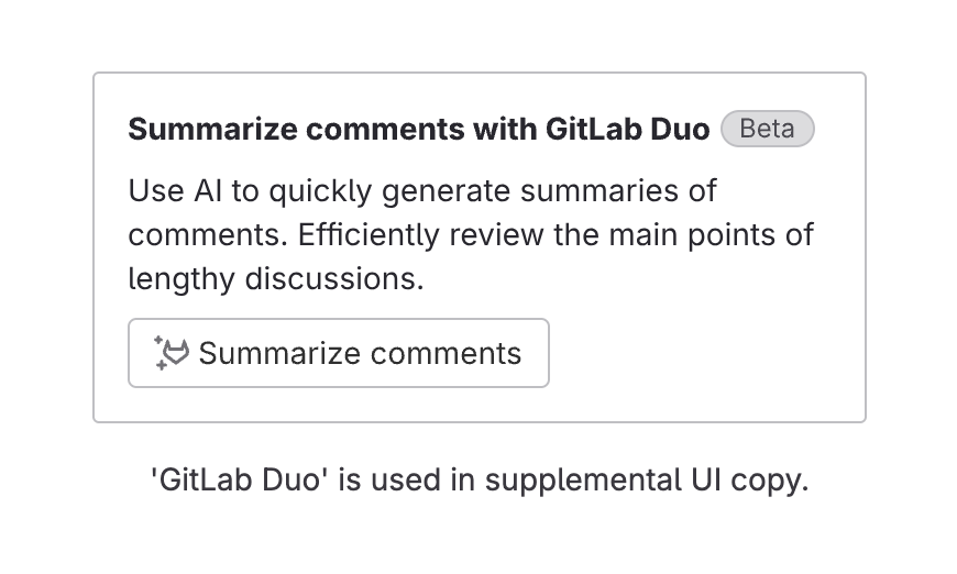
Next, it recommends being transparent about where AI is used–Pajamas does this with its “GitLab Duo,” an indicator of AI-features, capabilities, and limitations.
Since the “GitLab Duo” is used for AI-features and interactions (and not any AI content), Pajamas also recommends flagging AI-generated content with “<Verb> by AI” (I.E., “Summarized by AI”), as well as a message encouraging users to check the AI-content.
GitLab is also working on a framework to practice their guidelines; it’s currently in-progress, but the general work can be viewed in GitLab’s AI UX Patterns. Their goal is to release an AI-pattern library with documentation–just what we need (pleaseee!).
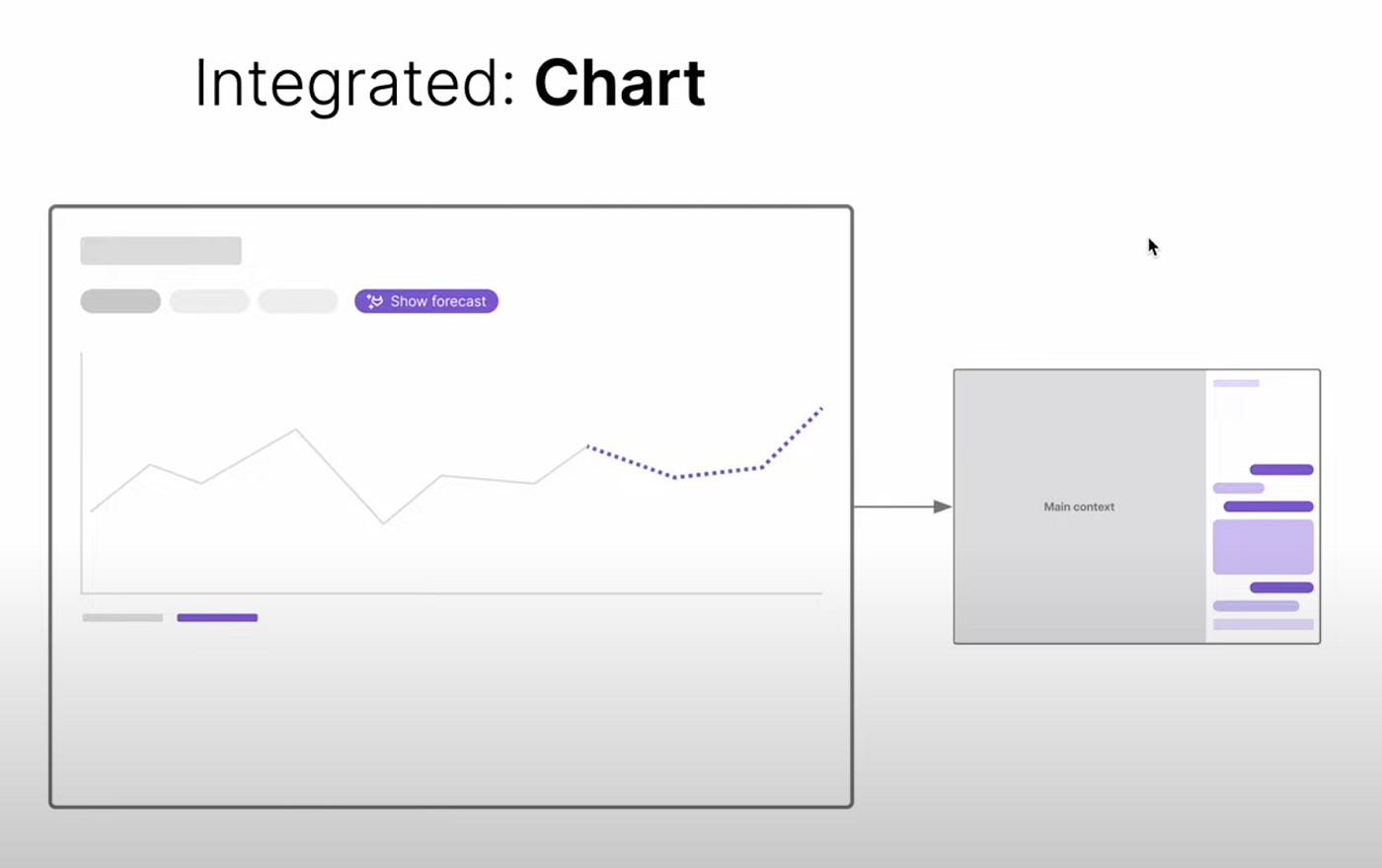
GitLab’s vision for their AI UX patterns is split into 4 dimensions to help select the right AI pattern: Mode, Approach, Interactivity, and Task.
Mode: The emphasis of the AI-human interaction (focused, supportive, or integrated)
Approach: What the AI is improving (automate or augment tasks)
Interactivity: How the AI engages with users (proactive or reactive)
Task: What the AI system can help the user with (classification, generation, or prediction)
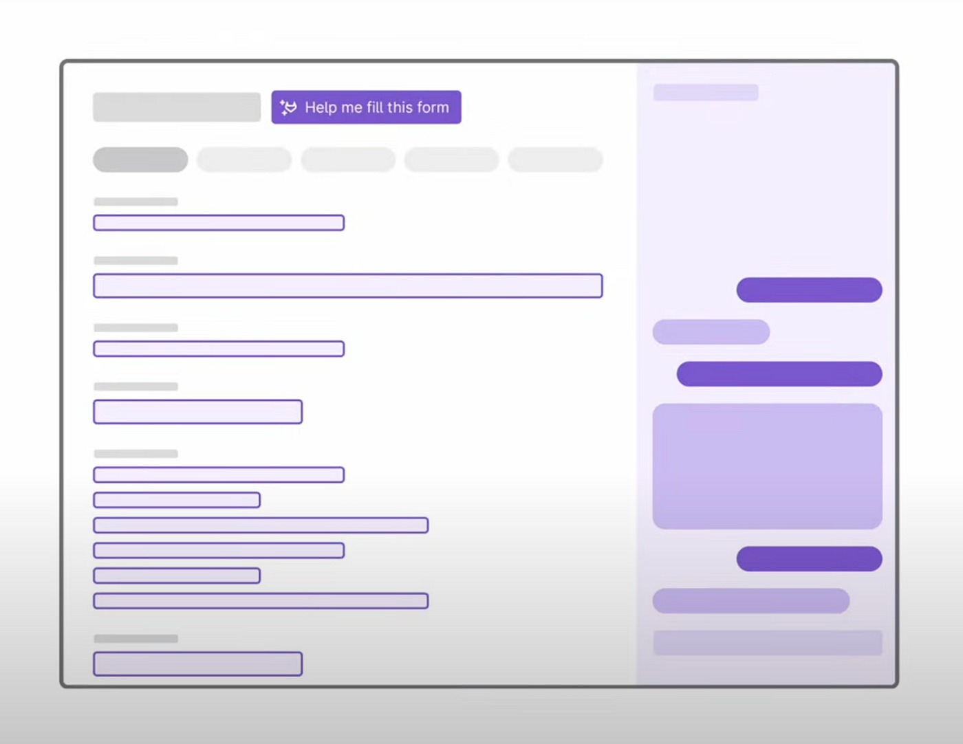
For example, their early explorations for AI patterns include low-fidelity mockups of how AI can be integrated in an interface with charts or inline explanations. The patterns clearly mark the usage of AI to help build user understanding and trust with the AI system.


Verdict
Currently, GitLab’s documentation is conceptual and generalized to how they want the AI UX experience to be like in the future. But it gives a solid framework that most design systems could adopt–no matter the industry or product.
I’m hopeful they release more in-depth information about their AI UX patterns soon. I think it could be a great open-source asset to other design systems developing their AI documentation.
2. IBM’s Carbon
Out of the open-source design systems, Carbon has the most robust documentation for AI usage. It includes an AI-dedicated section, “Carbon for AI,” which encompasses components, patterns, and guidelines to help users recognize AI-generated content and understand how AI is used in the product.
Carbon for AI builds on top of the existing Carbon components–adding a blue glow and gradient to highlight instances of AI. So far, there are 12 components with AI variants, such as a modal, data table, and text input.
Though the AI variants of the components are given a distinct visual treatment, in context, it’s difficult to distinguish which component is currently active (because they all look active).
In the below form, AI was used to auto-fill most of the input fields, so these fields use the AI-variants. The AI-variants receive a blue gradient and border even if it’s in a default state–making it hard to visually identify which component is active.


