Try this 1-minute design debt check (before it costs you)
A quick framework to what to fix now vs. what can wait.
Hey there! This is a 🔒 subscriber-only edition of ADPList’s newsletter 🔒 designed to make you a better designer and leader. Members get access to exceptional leaders' proven strategies, tactics, and wisdom. For more: Get free 1:1 advisory | Become an ADPList Ambassador | Become a sponsor
Design debt sneaks in like dust.
One small compromise here, another tweak there, and suddenly your clean product feels... heavy.
Design debt grows quietly but costs loudly. If left unchecked, it leads to:
❌ Confused users – Inconsistent elements fracture trust.
❌ Slower teams – Designers spend more time untangling old UI than innovating.
❌ Feature hesitation – "We can't add that because it will break this."
Here’s how to identify and fix it before it costs you.
⏲ Run the 1-minute Test
Take 5 minutes! Click through your product.
Ask yourself:
"Why is this here?" – If you hesitate, that's debt.
"Does this align with the current brand/system?" – Outdated UI elements scream debt.
"Is this the simplest way?" – Complex flows = creeping debt.
A quick framework to evaluate if your product is accumulating design debt. What to fix now vs. what can wait.
***
💎 Lessons from big companies
1. 💸 Citibank's $500 Million Mistake:
In 2020, Citibank accidentally transferred $900 million instead of $7.8 million due to a poorly designed, confusing user interface in its software. This design debt resulted in irreversible financial loss.
Cleaning up interfaces for critical financial tasks could have prevented this mistake.
2. 😵💫 ClickUp's Navigation Confusion:
ClickUp's mobile app adopted an Android-style top tab navigation for iOS, conflicting with iOS user expectations. The mismatch led to frustrated users and slower adoption rates.
When they adjusted the design to fit iOS conventions, engagement improved.

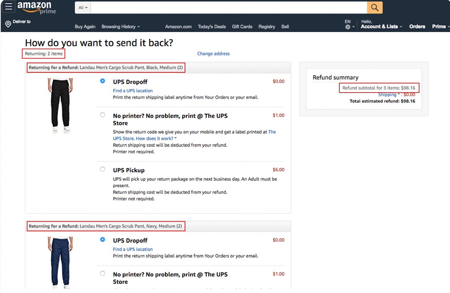
3. 📦 Amazon's Return Page Mix-Up:
Amazon’s return shipping page once displayed incorrect item counts, leading to confusion and abandoned returns. This inconsistency resulted in increased customer service calls.
By ensuring data accuracy and consistent design patterns, Amazon reduced errors and improved customer satisfaction.
***
🧠 Why Design Debt Checks Work Like Magic
Our brains crave simplicity and clarity. When users experience smooth, cohesive interfaces, they instinctively trust the product more.


