


Why Uber stopped this design
An insider story on how Uber understood their user's motivations to increase revenue.

Hi, I’m Felix! Welcome to this week’s ADPList’s Newsletter; 🔒 subscriber-only edition 🔒 weekly advice column. I write high-quality insights on designing products people love and leadership in tech. If you’re interested in sponsoring us, let’s chat!
Calling all SF Bay Area 🌁 design leaders, managers, and founders—I’m hosting an invite-only Fireside with Jakob Nielsen on “Future of Design and AI” in person on 10th October. You don’t want to miss this, apply for your seat here.
Insider story into Uber’s design experience that increased rides by 10%
Hi friends,
Imagine you are a leader (design, product) at Uber, driving the success of the # of ride growth per user. For context: When the rider is about to book a ride, they want to know how much they would pay for the ride.
In an effort to better manage unknown traffic, one of your designers experimented by showing a price range so Uber won’t lose money on any ride ($14-$20).
Below are the two versions (A and B):
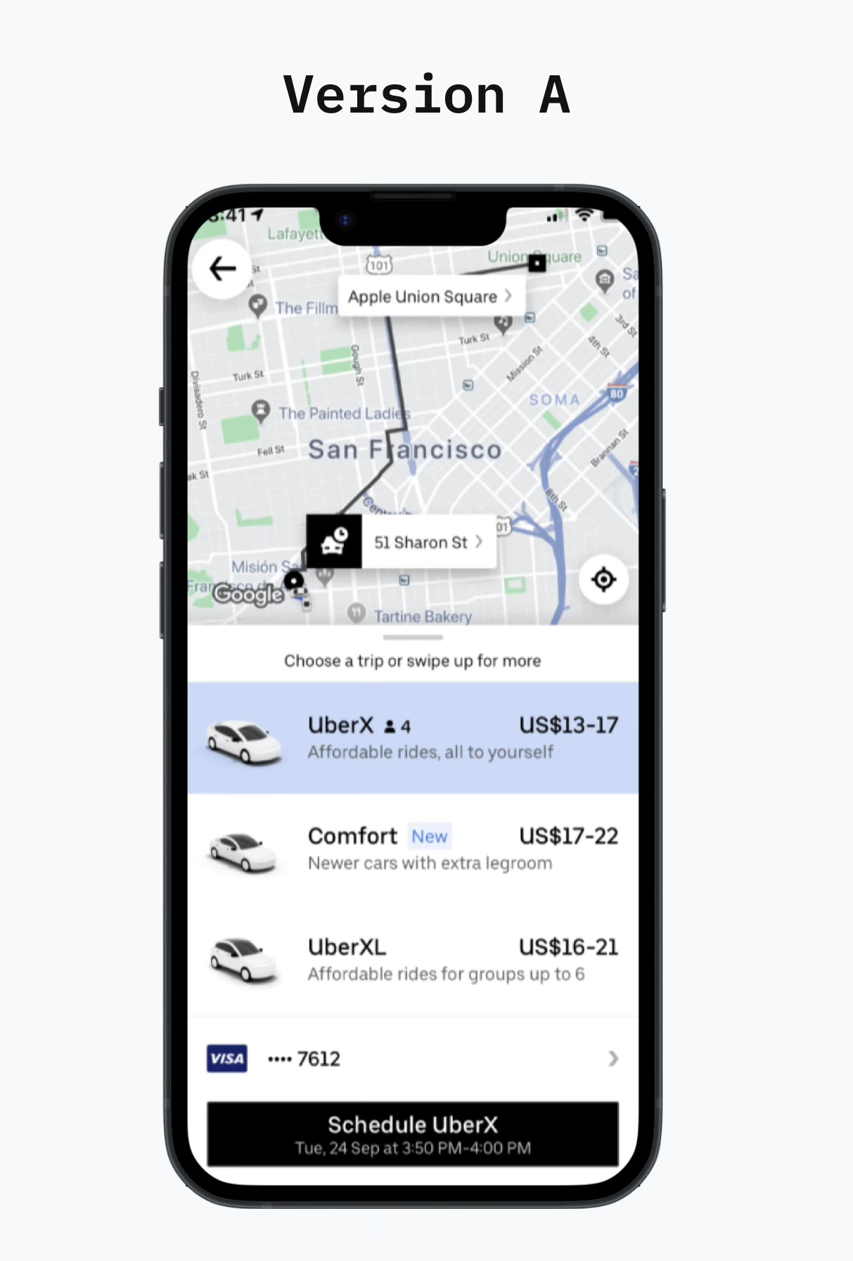
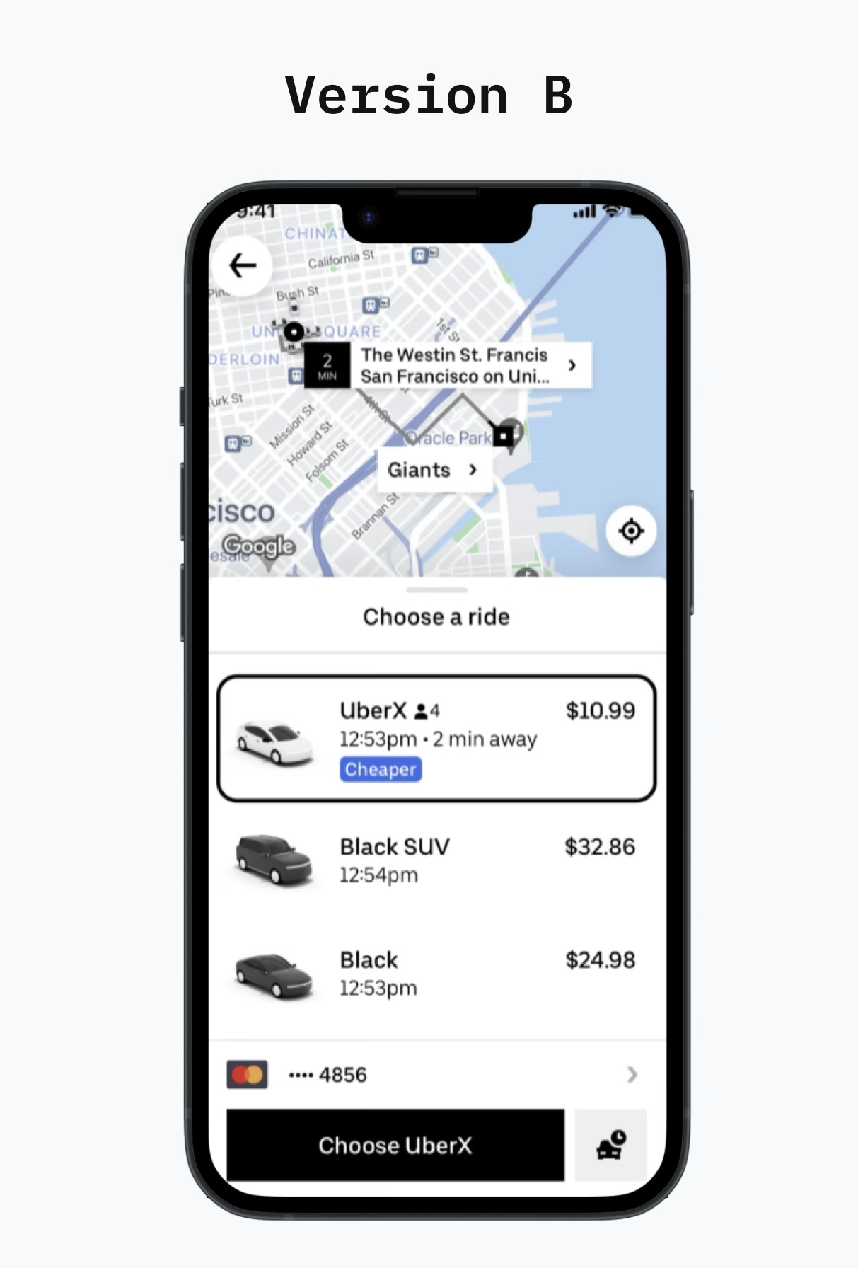
This is a tough one; notice the key differences.
Which version will perform better at having a user book a ride?
Uber ran this product experiment, and while it was well-intentioned, a certain approach led to unintended consequences. The winning version is…
🏆 Version B won this experiment! (comment if you got it and why?)
Why? Let’s dive into Uber’s genius formula for design: