Lessons on how design systems at Atlassian, Base & Material can scale and deliver
Practical frameworks from Material, Base, Polaris, Carbon, and Atlassian on building systems that actually work—with examples.
Hey there! This is a 🔒 subscriber-only edition of ADPList’s newsletter 🔒 designed to make you a better designer and leader. Members get access to exceptional leaders' proven strategies, tactics, and wisdom. For more: Get free 1:1 advisory | Become an ADPList Ambassador | Become a sponsor | Submit a guest post
Friends,
This week, we’re diving deep into the heart of great design systems — not the shiny components on the surface, but the invisible architecture underneath.
Design systems aren’t just about reusable buttons and Figma files. They’re about building trust across teams, syncing design with development, and creating clarity at scale. And the best ones? They don’t start with “what.” They start with why.
In this edition, we’re unpacking lessons from five of the most robust, battle-tested systems in the industry — Google’s Material Design, Uber’s Base, Shopify’s Polaris, IBM’s Carbon, and Atlassian’s Design System. These are more than libraries — they’re blueprints for consistency, speed, and seamless collaboration.
Here’s what we’re breaking down:
Why great systems are built on strong foundations — typography, spacing, motion, and tokens
How leading brands define components by intent, not just structure
The role of documentation as a product — not an afterthought
What true design-dev sync looks like in real-world teams
How these systems scale from startups to enterprise without losing clarity
This isn’t just about building cleaner UIs. It’s about solving real design-developer debt, creating scalable systems that grow with your product, and learning from those who’ve done it best.
Let’s get into it 👇
Pir Ahmed is a product designer, problem solver, and founder of Desnify.com, a simple, scalable UI system built for everyone to streamline design workflows. With a strong design sense and a systems-thinking approach to solving problems, Pir is dedicated to crafting experiences that feel intuitive and meaningful, turning ideas into tangible interfaces that people can truly feel and use.
Explore his work at pirahmed.com
You can connect with him on LinkedIn & Medium
Over the last few years, I have gone through many design systems than in my entire life. By going through, I don’t just mean skimming them but thoroughly reading and understanding what makes top design systems so great.
I started my career as a freelancer and later down the line after getting some experience and building real products, I always came across these design-dev inconsistencies. What I used to create in design never ended up being exactly the same in dev and oftentimes it were the foundations — typography, spacing, and the use of icons — that sucked.
Even when going through great products, one thing I have noticed is that they nail the basics. Once you learn to nail the basics, 90% of your design problems are already solved. And that’s when I realized the need of building a system. A system that is simple, scalable, and flexible enough to reuse across anything I worked on and most importantly, a system that’s synced with code to solve these design-dev debts.
So, I started building one.
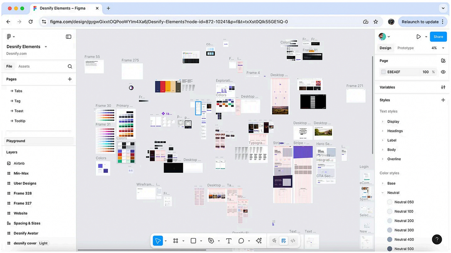
At first, it was a mess of rectangles, tokens, and scattered Figma components. I wasn’t trying to create a “great system.” I just wanted to organize things. Align buttons, clean up typography, set spacing rules, and stop copy-pasting the same card 47 times.
See, building something great starts off with understanding — whether it's understanding people and their problems, competitors, or even sometimes just checking out what makes others so good. Creating a great system isn’t just adding components, it’s a lot more than that. It’s about building clarity and a system that scales. A foundation that could support real teams, across different products, in fast-moving environments.
Out of thousands of design systems out there, I narrowed down to these five systems: 👇🏻
Google’s Material Design (M3): Known for its strong design philosophy, detailed docs, and consistent experience across platforms. Stands out for motion, elevation, and patterns inspired by the physical world.
Uber’s Base System: A lightweight, token-based system built for speed and flexibility in consumer products. Known for its solid foundations, theming options, and developer-friendly structure.
Shopify’s Polaris: Uses semantic tokens, a clear voice and tone, and strong UX foundations. Great at aligning design, content, and accessibility into one unified system for merchant tools.
IBM’s Carbon Design System: Built for enterprise-grade consistency, with strong grid systems, accessibility standards, and robust data visualization components — ideal for complex B2B applications.
Atlassian Design System: Focused on content-first interfaces, team collaboration patterns, and practical documentation — excels at systems that support modular workflows across multiple products.
These five systems didn’t just inspire me, they taught me what a great design system really looks like. Beyond the surface-level polish, they’re built on invisible rules, thoughtful decisions, and scalable structures that make the design feel effortless across teams and platforms.
This article is a collection of everything I have learned that makes these systems so good and the lessons you can apply while building your own system. Whether you’re creating something for a small startup or a global product suite, these principles will help you design systems that don’t just look good — they work beautifully, scale confidently, and earn the trust of everyone who touches them.
Let’s dive right in…
Great systems start with purpose, not patterns
Every designer on a team brings their own way of thinking and solving problems. And sometimes, the current set of components doesn’t quite fit the new design need — I’ve faced that plenty of times myself.
The best design systems in the world don’t start with what to build. They start with why it’s needed in the first place. Every strong system has a point of view. A purpose. A guiding principle that shapes decisions not just about visuals, but about language, structure, and philosophy.
Uber’s Base prioritizes modularity and speed. With hundreds of designers and developers across multiple teams, the system is built to be minimal, composable, and fast. Their button component for example, clearly defines its purpose and use — their button hierarchy makes it clear to only use one primary button per screen and that’s what keeps them consistent, help reduce decision fatigue, and help their users take actions immediately
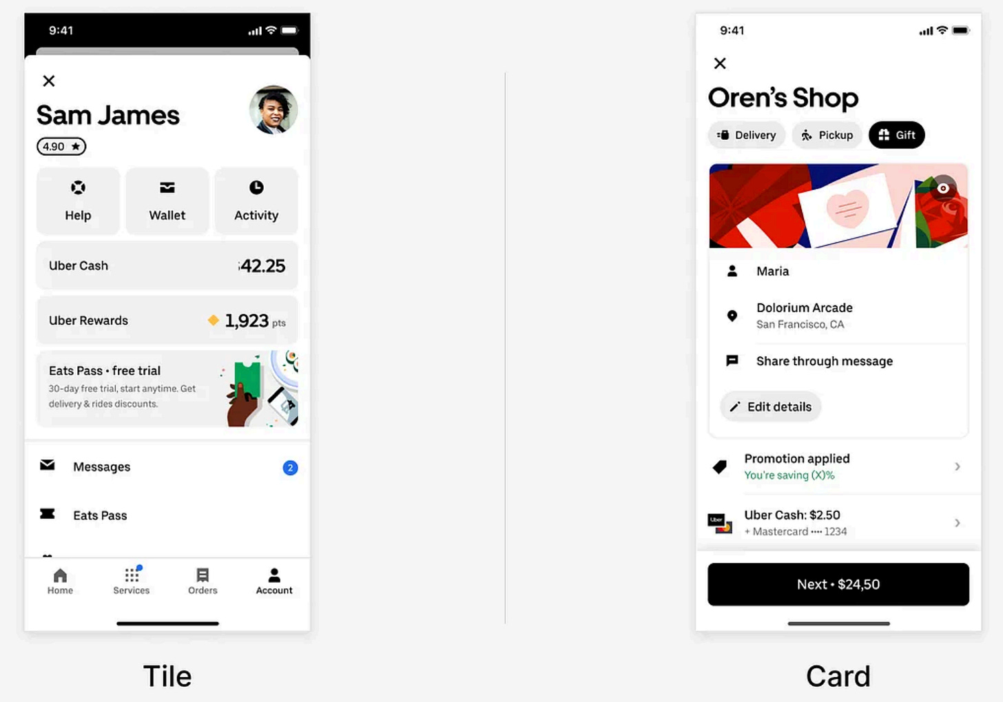
Another example is how Uber distinguishes between the Card and Tile components. At a glance, they may seem interchangeable but their use cases are thoughtfully separated:
Cards present related content inside a larger context like a summary of recent trips or an order history block and often have buttons for navigation/performing action.
Tiles are designed for actionable choices like selecting a vehicle type or payment method.
By defining these components based on intent, not just structure, Uber avoids the “this looks fine” trap. Instead, they encourage teams to design with consistency, clarity, and shared mental models, all of which translate to smoother experiences for the end user.
Foundations are invisible, but they power everything
Oftentimes, developers overthink the foundations and that’s where most design debt begins. The truth is, you can’t scale good design without solid foundations.
Think of it like building a house. If the foundation isn’t strong, it doesn’t matter how beautiful the house looks. It won’t last. The same goes for design systems. Some of the best systems in the world don’t just focus on polished components. They start with the pieces underneath.
All these foundations work silently to bring consistency across components and products. After all, every component you build is made up of those same building blocks. These foundations include:
Spacing scale
Typography
Color system
Elevation (shadows, layering)
Motion principles
Responsive grid
Tokens — the glue that makes it all scalable
One thing that I like the most about Shopify Polaris is its use of semantic tokens. Apart from their primitives, they use meaningful naming conventions like:
--p-bg-surface , --p-bg-surface-error , --p-bg-fill-brand , --p-text-heading-3xl-font-size , and --p-space-025.
These tokens describe what something is for and creates a shared language across teams. Writers, designers, and developers all know what “surface” or “brand” means in context. It also helps when theming or scaling. If you need to change the background color of all surfaces, you update one token. Done.
On the other hand, Material Design (M3) often splits them between design tokens and dynamic color systems. Their color tokens adjust based on themes or user preferences, like light and dark mode, using values like primaryContainer, onSurface, and tertiary. Their typography tokens are tied to levels (like headlineLarge, bodyMedium, etc.), while their motion and elevation foundations help maintain depth and hierarchy across devices.
Material’s strength lies in its cross-platform consistency — these tokens apply across Android, Web, Flutter, and more.
Documentation is your superpower (How to)
Most people treat documentation as a checklist item. The best systems treat it like a product of its own. Why? Because adoption depends on how usable and understandable your system is, not just how good it looks or how many components it has.


