The "5-second hack" no designer is using
Every successful product should pass this test (+my favorite examples)
Hey there! This is a 🔒 subscriber-only edition of ADPList’s newsletter 🔒 designed to make you a better designer and leader. Members get access to exceptional leaders' proven strategies, tactics, and wisdom. For more: Get free 1:1 coaching | Become an ADPList Ambassador | Become a sponsor
Announcement for designers
Calling all designers shaping the future! Join design visionary Pablo Stanley for an exclusive deep-dive into ‘The Secret of Creativity: AI & Design.’ Discover cutting-edge strategies to harness AI for breakthrough ideas, elevate your design process, and future-proof your career in 2025.
Ready to dive into AI Design?
👉 Reserve your spot now and step into the next era of design!
Now, back to today’s post… 🔽
Every successful product should pass this test (+my favorite examples)
Let’s be real honest here for a second…
Most users will give your product 5 seconds. That’s it.
If they can’t figure out what your product does—or how to take action—they’re gone.
💡 What’s the 5-second Test?
You put your landing page, homepage, or app screen in front of someone for 5 seconds.
Then ask: "What did you just see? What can you do here?"
That’s it.
🌟 Why this test works so well
Our brains skim through information quickly. People look at websites the same way they glance at billboards on the highway. If your page doesn’t pass this quick test, it’s probably too complicated.
You’ll get better feedback when the design is simple. Once you cut out the extra stuff, things become clearer:
People stay longer. A simple, easy-to-understand design makes users feel comfortable.
More sign-ups or sales happen. When it’s obvious what to do, people take action.
Your team gets on the same page. The test shows what parts of the design are confusing, so everyone can focus on fixing them.
🏆 Real-Life Example:
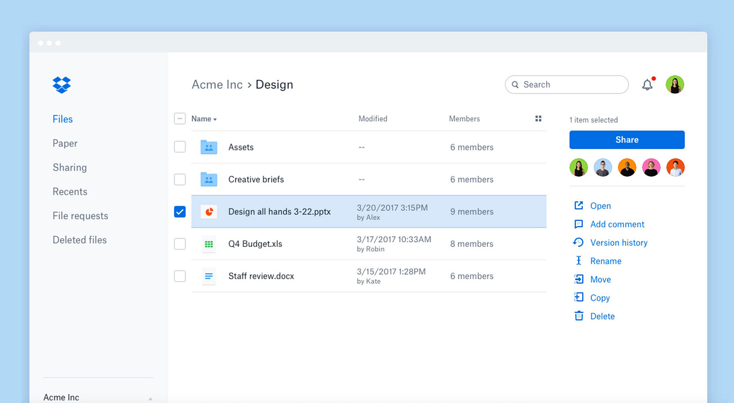
Dropbox's Homepage Redesign:
Dropbox simplified their homepage by focusing on one clear action – sign up. Previously cluttered with multiple features, the redesign focused on visual clarity and concise messaging. After running user tests, they saw a noticeable increase in conversions.
Slack’s Onboarding Flow:
Slack’s initial onboarding was too text-heavy. A 5-second test revealed that users felt overwhelmed. Slack simplified the process by using short, clear steps, increasing retention and reducing drop-off.Airbnb Search Experience:
Airbnb's search page used to present users with multiple options and filters upfront. After testing, they streamlined the search bar and limited distractions, making the experience more intuitive. This small change resulted in higher engagement and more bookings.
💥 How to run the test (step-by-step guide):
Pick an important page. This could be a landing page, sign-up form, or dashboard—wherever user confusion could hurt your results.


