Extremely honest design
How Opal designs a brilliant experience that increased its sign-ups from 7% to 17%.
👋 Hi, I’m Felix! Welcome to this week’s ADPList’s Newsletter; 🔒 subscriber-only edition 🔒. Each week, I reveal proven & untold insights on designing things people love and insider career advice from top experts. Want to support us? Be our sponsor!
This post is brought to you by Shortform. A game-changer for busy readers! Access high-quality book guides with summaries & actionable insights to learn key ideas efficiently. Plus, their AI extension summarizes articles, freeing up time to focus on what matters most! 👉 Claim your 20% discount now!
An insider story into 120 A/B tests by Opal App to improve trial sign-ups by +10%
Hi friends!
Imagine you are a leader (design, product) at Opal (focus app), driving the success of their product conversion to subscription.
One of your designers comes to you with two options for the conversion page. Both designs are clean and modern, but they tell very different stories.
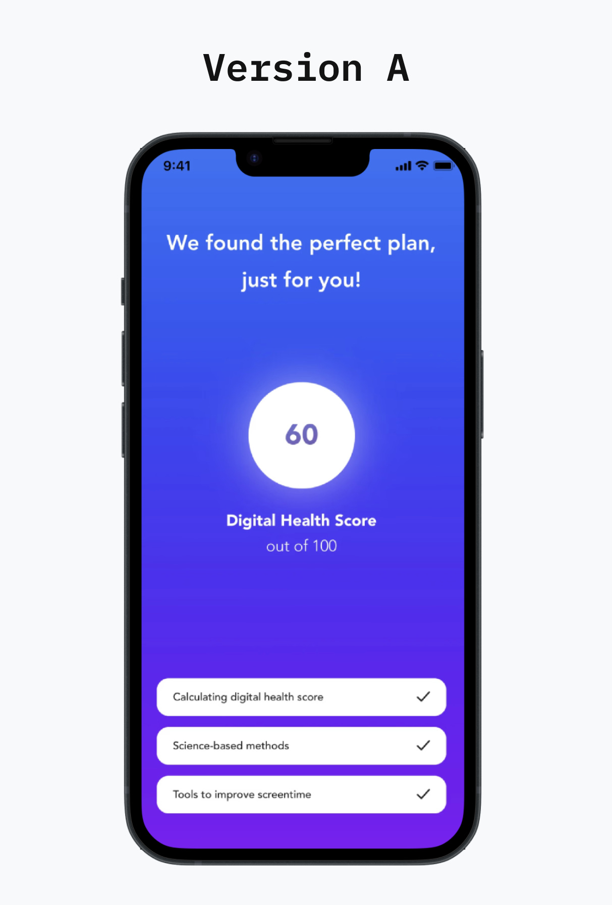
🅰 Version A takes an optimistic approach.
It greets users with an encouraging "We found the perfect plan, just for you!" and a digital health score of 60/100. The interface is bathed in calming blues and purples, with reassuring checkmarks showing science-based methods and tools to improve screen time.
It's like a friendly coach saying, "We've got this figured out together."
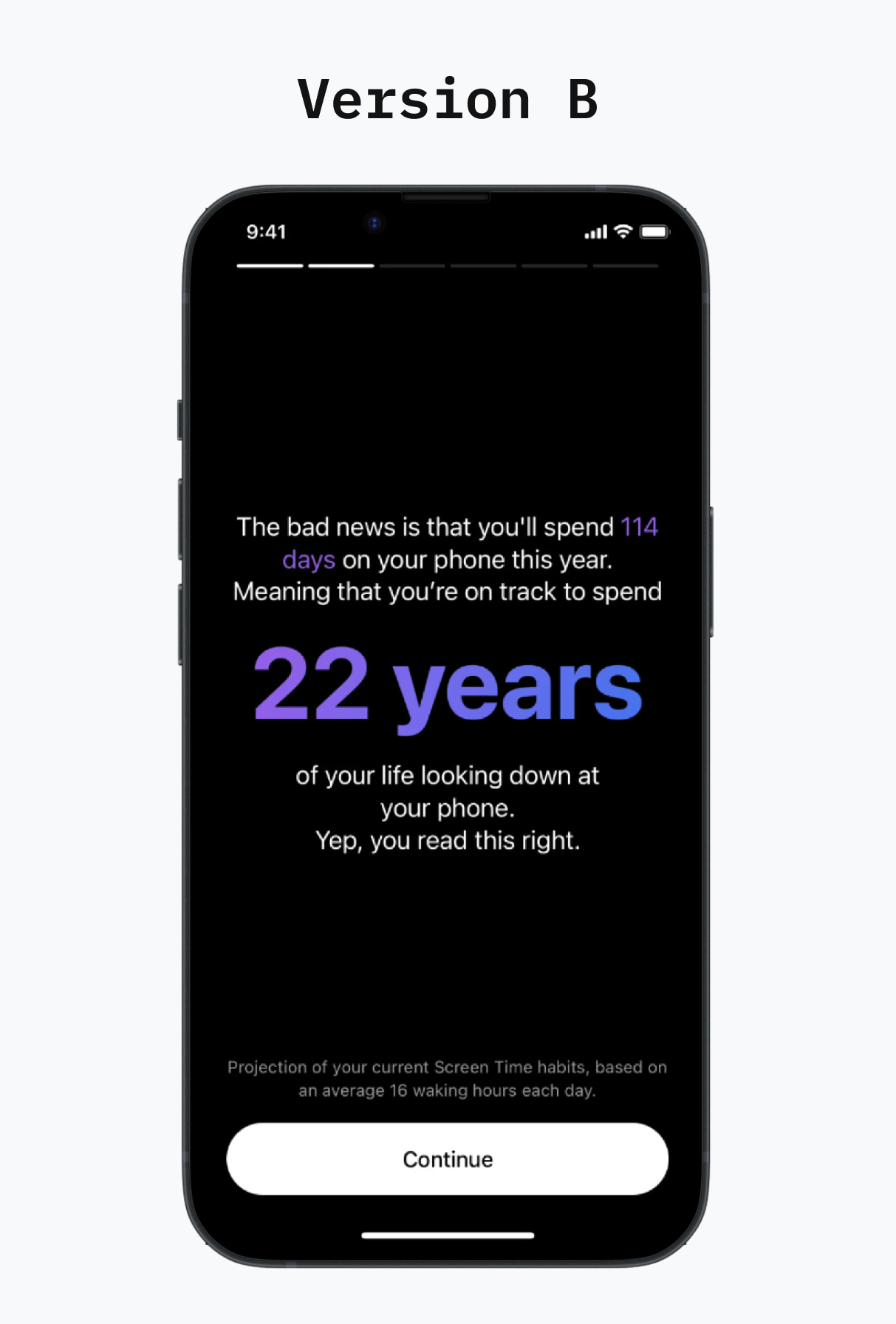
🅱️ Version B goes for a wake-up call.
It presents users with a striking statistic: 114 days on their phone this year, equivalent to 22 years of their life "looking down at your phone." The message is delivered against a stark black background, with those numbers in bold purple – impossible to ignore.
It's like a friend giving you a reality check over coffee.
Which version do you think drove more sign-ups?
Before you answer, consider these psychological factors:
Does fear of missing life motivate change more than the promise of improvement?
Do people respond better to positive encouragement or confronting reality?
Which message makes users feel more empowered to take action?
Would you rather know your current score or face the long-term impact?
The answer WILL surprise you, revealing something fascinating about human psychology and our relationship with our devices.
🥁🥁🥁… The answer: Version B Won.
Version B drove significantly more sign-ups, from 7% to 17%.
Here's why this matters for product designers and leaders:


