Dark Design Patterns: Don’t Do Any of This!
This is the most powerful dark design patterns study, by Jakob Nielsen
Hello, I’m Felix! Welcome to this week’s ADPList’s Newsletter; 🔒 subscriber-only edition 🔒weekly advice column. Each week, we tackle design, building products, and accelerating careers. If you’re interested in sponsoring this fast-growing community, let’s chat!
This week’s exciting article is contributed as a Guest Post by the one and only, Jakob Nielsen — so graciously did it when we asked! Ready for this interesting topic? I bet, you won’t find this anywhere on the internet.
Your opportunity to meet Jakob Nielsen, Julie Zhuo, and Sarah Gibbons on ADPList!
This is our most powerful line-up. Join exclusive sessions as we interview world-class design and product leaders and career experts to uncover power-packed, actionable insights to help you build a successful career.
Fireside with Julie Zhuo. “Early Facebook, Data & Design and Being a Founder.” On Feb 15 at 10:30am PT 👉 Click here to register today
Fireside with Jakob Nielsen and Sarah Gibbons. “The Future of Design and UX.” On Feb 22 at 10am PT 👉 Click here to register today
Free seats are running out fast 🔥 Hurry up to register and share it with your network!
“Dark design patterns” are ways of cheating users through various misleading user interfaces — or sometimes simply by making it unnecessarily difficult to accomplish actions that the user wants but that the company wants to prevent, such as canceling a subscription. Simply evil!
In the United States, the Federal Trade Commission (FTC) recently filed suit against Amazon.com, alleging that it stepped over the line, intending to dupe customers into subscriptions they never sought and preventing them from escaping the traps they had unwittingly entered. This case is not resolved, so we don’t know if Amazon’s dark patterns are illegal. In my review of the case, I deemed some of Amazon’s dark design patterns sufficiently egregious to be worth 4 of 5 skulls, whereas others only earned 2 of 5 skulls.
On November 30, 2023, the Government of India issued new regulations outlawing many dark design patterns in India. (Warning: this link leads to an 11-page PDF file that includes the new regulations first in Hindi and then in English.) I’ll list and evaluate the dark patterns they mention in the new Indian regulations, even though this will be at the risk of giving certain people bad ideas.
Hopefully, the fact that these dark design patterns are now illegal in the world’s largest country will serve as an impediment to more companies embracing these nasty ideas. In any case, I have always believed more in shining light on nefarious dark practices than in trying to keep them secret.
In total, the regulations list 12 dark design patterns, which I’m discussing below. (They also prohibit malware, but since that’s not a design element, I’m not discussing malware further in this article.) As you can see, they are of different degrees of obnoxiousness, but they are all bad and should be avoided by ethical UX professionals. Now you have my word for this as well as the word of the Indian Government.
False Urgency
This is defined as falsely stating or implying a sense of urgency or scarcity so as to mislead a user into making an immediate purchase or taking immediate action. Examples are showing the false popularity of a product or service to manipulate user decision, or stating that quantities of a particular product or service are more limited than they are.
This dark design pattern is an abuse of the well-known scarcity principle from behavioral economics, which says that limited product availability increases its perceived value and consumer demand.
Since false urgency involves actively lying to users, it’s one of the worst dark patterns, and so I rate it:
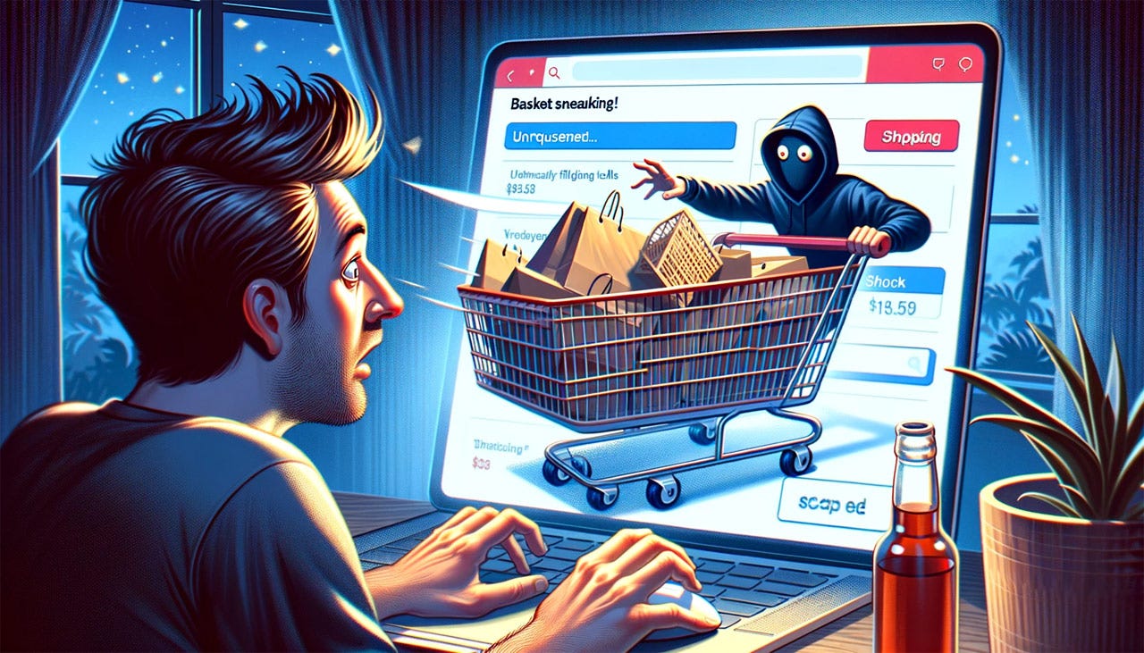
Basket Sneaking
In the US, the equivalent name would be “Cart Sneaking” since it’s more common to refer to a shopping cart than a shopping basket when discussing e-commerce UX.
“Basket sneaking” means adding additional items such as products, services, payments to charity, or donations at the time of checkout from a platform without the consent of the user, such that the total amount payable by the user is more than the amount payable for the product or service chosen by the user.
The regulations sensibly clarify that free samples, providing complimentary services, or the addition of necessary fees disclosed at the time of purchase shall not be considered basket sneaking.
(Of course, this begs the question of whether such fees are indeed disclosed with sufficient usability and not hidden in a part of the page that we know from eye-tracking attracts little attention.)
Assuming that the extra items are still listed as line items in the shopping cart, this may not quite rise to the level of a 5-skull design sin. However, because basket sneaking is stealing from any users who don’t scrutinize their checkout forms, I still rate it:
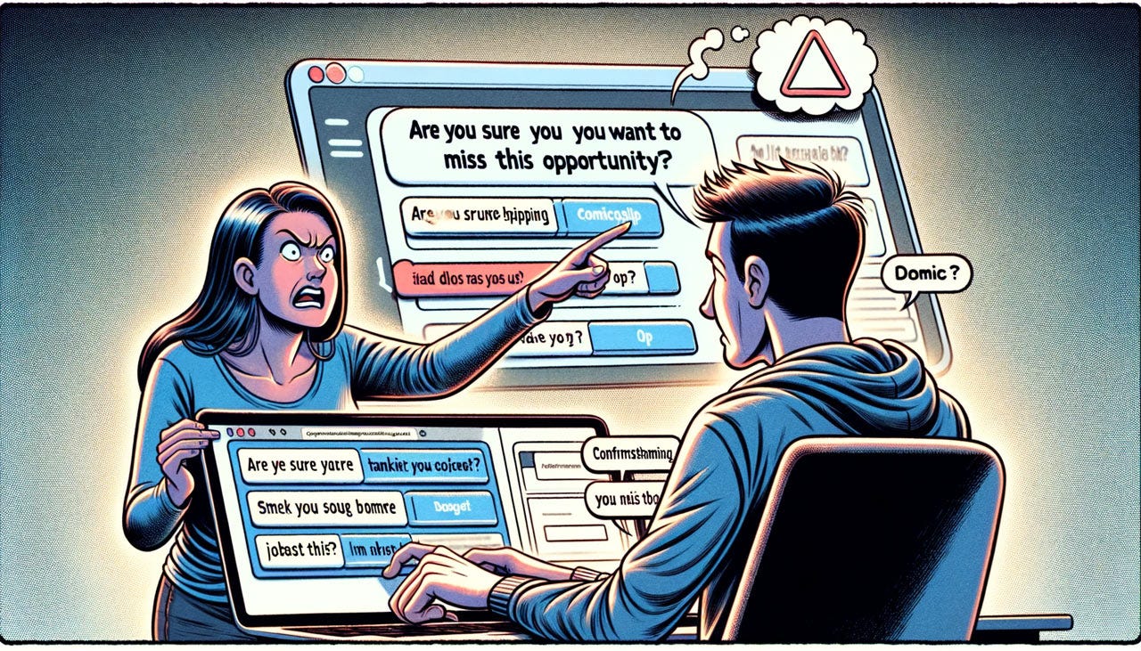
Confirmshaming
Confirmshaming (also sometimes called manipulinks) means using a phrase, video, audio, or any other means to create a sense of fear, shame, ridicule, or guilt in the mind of the user to nudge the user to act in a certain way that results in the user purchasing a product or service from the platform or continuing a subscription of a service, primarily to make commercial gains by subverting consumer choice. The example given in the Indian regulations is a travel site that the phrase, “I will stay unsecured,” when a user does not add insurance to the purchase of an airline ticket.
While unpleasant, I don’t view confirmshaming as nearly as harmful as the other dark design patterns since it doesn’t trick users. It simply goes overboard with another behavioral economics principle: framing (how the presentation of information influences decisions, with different wordings or contexts leading to varying perceptions and choices by individuals). I only judge this dark pattern to rate:
Forced Action
This happens when a user is prevented from buying or subscribing to the product or service originally intended by the user without taking an action that would require the user to buy additional goods, subscribe or sign up for an unrelated service, or share personal information.
This dark pattern can rate different numbers of skulls, depending on the specific implementation. One example is when a vendor simply has forced bundles, where you can’t buy product A without buying product B. This is common when selling cable TV subscriptions and is often strongly disliked by customers who don’t like paying for channels they don’t watch. However, if the bundling is disclosed upfront, then I don’t view this as a dark pattern regarding user interface design. Overcharging is not dark; it’s simply unpleasant, and customers can take it or leave it as they please, depending on whether they judge the value of the one thing they want to be higher or lower than the price of a bundle that includes some worthless items. Under the assumption of clear up-front disclosure, this type of bundling (or forced purchase of more than the user wants) rates:
On the other hand, several scenarios described in the Indian regulations are much more nefarious. For example, “prohibiting a user from continuing with the use of product or service for the consideration originally paid and contracted for, unless they upgrade for a higher rate or fee.” This is a bait-and-switch.
Another nasty example is forcing a user to download an unintended or unrelated separate app to access a service originally advertised on another app. For example, a user downloads an app X, meant for listing houses for rent. Once users download X, they are forced to download another app, Y, for hiring a painter. Without downloading Y, the user cannot access any services on X.
Such examples of forced action, where the add-on is not known before the user has committed to the first step, are truly bad and rate:
Subscription Trap
This dark pattern is the common case of making it substantially harder to cancel a subscription than it was to start the subscription in the first place. Of course, the is no end to how difficult a company can make it to escape its clutches, but the most common cases of this dark design pattern rate:
Interface Interference
This approach manipulates the user interface in ways that (a) highlights certain specific information; and (b) obscures other relevant information relative to the other information; to misdirect a user from taking an action as desired.
Obviously, any UX design has to make some things more prominent than others. That’s not dark in and of itself. As I have always said, if everything is highlighted, nothing is highlighted.
The question is how unbalanced the information presentation is, especially in regards to downplaying options that users are likely to want, such as closing an advertising popup. In extreme cases, options or disclosures needed by the user can be so hidden that this pattern can be worth up to 5 skulls. But in most cases, you can still see the information you need, even when it’s played down more than it should be, for example by using a smaller typeface. These more common cases rate:
Bait and Switch
This is the practice of advertising a particular outcome based on the user’s action but deceptively serving an alternate outcome.
For example, a website offers a quality product at a cheap price, but when the consumer is about to pay or buy, the site states that the product is no longer available and instead offers a similar-looking product that is more expensive.
This is sufficiently deceptive to be worth almost 5 skulls, but under the assumption that the user is informed that the new product is not the one he or she originally wanted, I will rate this practice as:
Drip Pricing
This covers several different cases where the full price is not revealed upfront.
Various extra fees are only revealed surreptitiously within the user experience, which used to be very common on travel sites.
A product or service is advertised as free without appropriate disclosure of the fact that the continuation of use requires later payment.
The final price is not disclosed until after the purchase, i.e., charging an amount higher than the amount disclosed at the time of checkout.
These three examples are at quite different levels of egregiousness. In order of the above listing, I rate them:
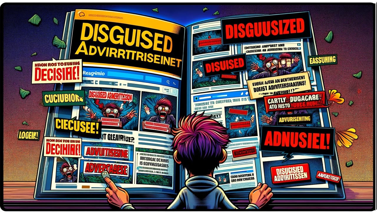
Disguised Advertisement
This is when advertisements are cloaked as other types of content, such as user-generated content or news articles. Even worse examples include false advertisements, which are designed to blend in with the rest of an interface in order to trick customers into clicking on them.
Definitely annoying, but ultimately not as harmful as the other dark design patterns discussed here, so I rate this practice as:
Nagging
This term covers designs where a user is disrupted and annoyed by repeated and persistent interactions, in the form of requests, information, options, or interruptions, to effectuate a transaction.
Absolutely annoying, but more shade of gray instead of a truly dark pattern, as long as it’s clear what the annoying interruptions are asking for. The reason this design pattern does qualify as dark after all is that the designers hope that users will eventually click “OK” in the classic fly-swatting behavior to make the interruptions do away without actually reading what they’re agreeing to. I rate this:
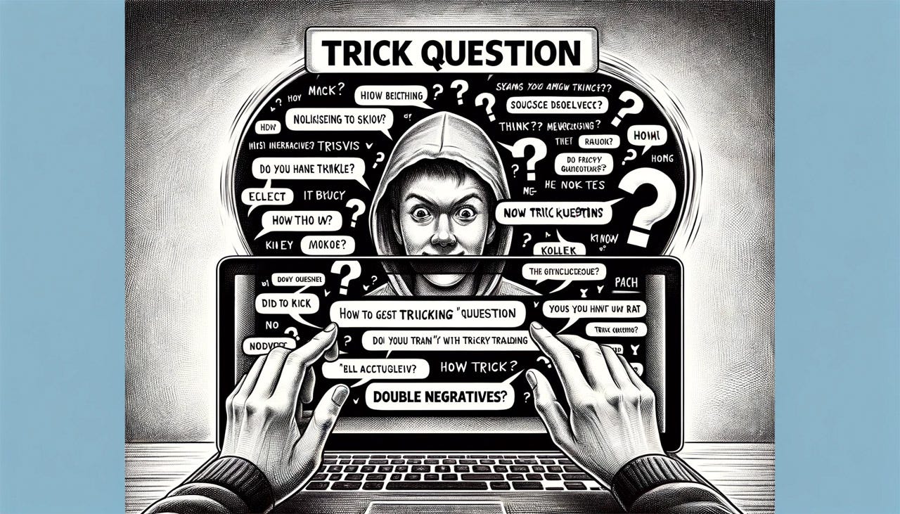
Trick Question
This is a dark use of the UX writer’s craft, to employ confusing or vague wording, double negatives, or other similar tricks, in order to misguide or misdirect a user from taking the desired action or leading the consumer to take a specific response or action.
Maybe it’s because I am a writer at heart, but I find it offensive to deliberately write content that is misleading or difficult to understand. I rate this:
Billing Surprise
The Indian regulations cover the process of generating and collecting payments from consumers on a recurring basis in a software as a service (SaaS) business model by exploiting positive acquisition loops in recurring subscriptions to get money from users as surreptitiously as possible.
The key word that makes billing practices dark is “surreptitiously.” Examples include no notification to the user when a free trial is converted to paid and silent recurring transactions whereby the user’s account is debited without being notified.
These practices come very close to stealing from users and rate:
Even More Dark Patterns to Avoid
Sadly, even this list of 12 dark design patterns is not comprehensive. The ability of rogue designers to think up ways of hurting users is endless. I am sure new dark patterns will be invented in future years.
We have 3 defenses against dark patterns:
Ethical UX professionals can push back on requests to add dark patterns to their design, by explaining the long-term harm this customer abuse will do to any brand.
We can shame those companies that deploy dark design patterns, explaining why these designs are known to be harmful.
As the final recourse, regulations like the new Indian rules might result in fines or other consequences for companies that persist with particularly harmful design practices.
About the Jakob Nielsen
Jakob Nielsen, Ph.D., is a usability pioneer with 41 years experience in UX and the Founder of UX Tigers. He founded the discount usability movement for fast and cheap iterative design, including heuristic evaluation and the 10 usability heuristics. He formulated the eponymous Jakob’s Law of the Internet User Experience. Named “the king of usability” by Internet Magazine, “the guru of Web page usability” by The New York Times, and “the next best thing to a true time machine” by USA Today. Previously, Dr. Nielsen was a Sun Microsystems Distinguished Engineer and a Member of Research Staff at Bell Communications Research, the branch of Bell Labs owned by the Regional Bell Operating Companies. He is the author of 8 books, including the best-selling Designing Web Usability: The Practice of Simplicity (published in 22 languages), the foundational Usability Engineering (26,552 citations in Google Scholar), and the pioneering Hypertext and Hypermedia (published two years before the Web launched). Dr. Nielsen holds 79 United States patents, mainly on making the Internet easier to use. He received the Lifetime Achievement Award for Human–Computer Interaction Practice from ACM SIGCHI.
You can follow Jakob for more on LinkedIn and Jakob’s Newsletter.
See you next week! Until then, have a fulfilling and productive week 🙏
ADPList gives every person the freedom to grow together - by opening doors to mentors worldwide. Join over 195K+ learners and meet your mentor today. We’re on a mission to give the world the freedom to grow together.
If you find this newsletter valuable, share it with a friend, and consider subscribing if you haven’t already. There are Referral Bonus available for our community.
Written with ❤️,
Felix Lee







Great read! Always irks me when e-commerce sites tell me “buy now only 2 left”😡
Heya, there is a strong agreement among the design community that the term "dark patterns" (which first emerged conceptually in 2010) reflects a unacceptably negative bias against things that are "dark" and that we need to update this language to be more mindful and less harmful. "Deceptive design patterns" is the better term most agree captures the intent of the concept. Please see https://medium.com/@carolinesinders/whats-in-a-name-unpacking-dark-patterns-versus-deceptive-design-e96068627ec4 or any one of the other thoughtful pieces on this matter. Thank you!