Steal these brilliant design tactics
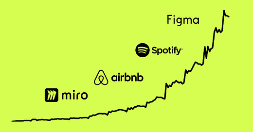
A breakdown of the world's best proven design: Figma, Notion, Airbnb, Spotify and Miro.
👋 Hi, I’m Felix! Welcome to this week’s ADPList’s Newsletter; 🔒 subscriber-only edition 🔒. Each week, I reveal proven & untold insights on designing things people love and insider career advice from top experts. For more: Be our sponsor | Get free 1:1 advisory | Become an ADPList Ambassador | Join AI Design Summit 2024 on Dec 4th
I love finding inspiration in the work of others. It removes current limitations and stimulates creativity, leading to imaginative thoughts of possibilities.
Over the past two years, I've registered in more than 50 products and tools, from Jira to Slack. Today, I want to dedicate ADPList’s Newsletter to examining some of the standout examples: Referral email (Airbnb), cancellation flow (Figma), and even my favorite ‘aha’ onboarding (Miro) and people’s choice (Spotify). I hope these product screenshots motivate your upcoming design initiatives.
Once you finish reading, feel free to join the discussion on LinkedIn and share your personal favorites.
Here’s the full post and breakdown 🔽.
Favorite trust-led design: Notion
Social proofs are the most robust way to design trust, from reviews to ratings. There are six prominent manifestations of social proof. Including:
✅ Validation from a Subject Matter Expert
✅ Vouching by Celebrities
✅ Seal of Trust from Trusted Entities
✅ Empowerment through Data
✅ Feedback from Genuine Customers
✅ Independent Reviews
Leveraging social proof as an integral part of the user experience is a product growth strategy greatly appreciated in the best product-led companies, something at ADPList we are keenly incorporating into our playbook.
And if this wasn’t enough…
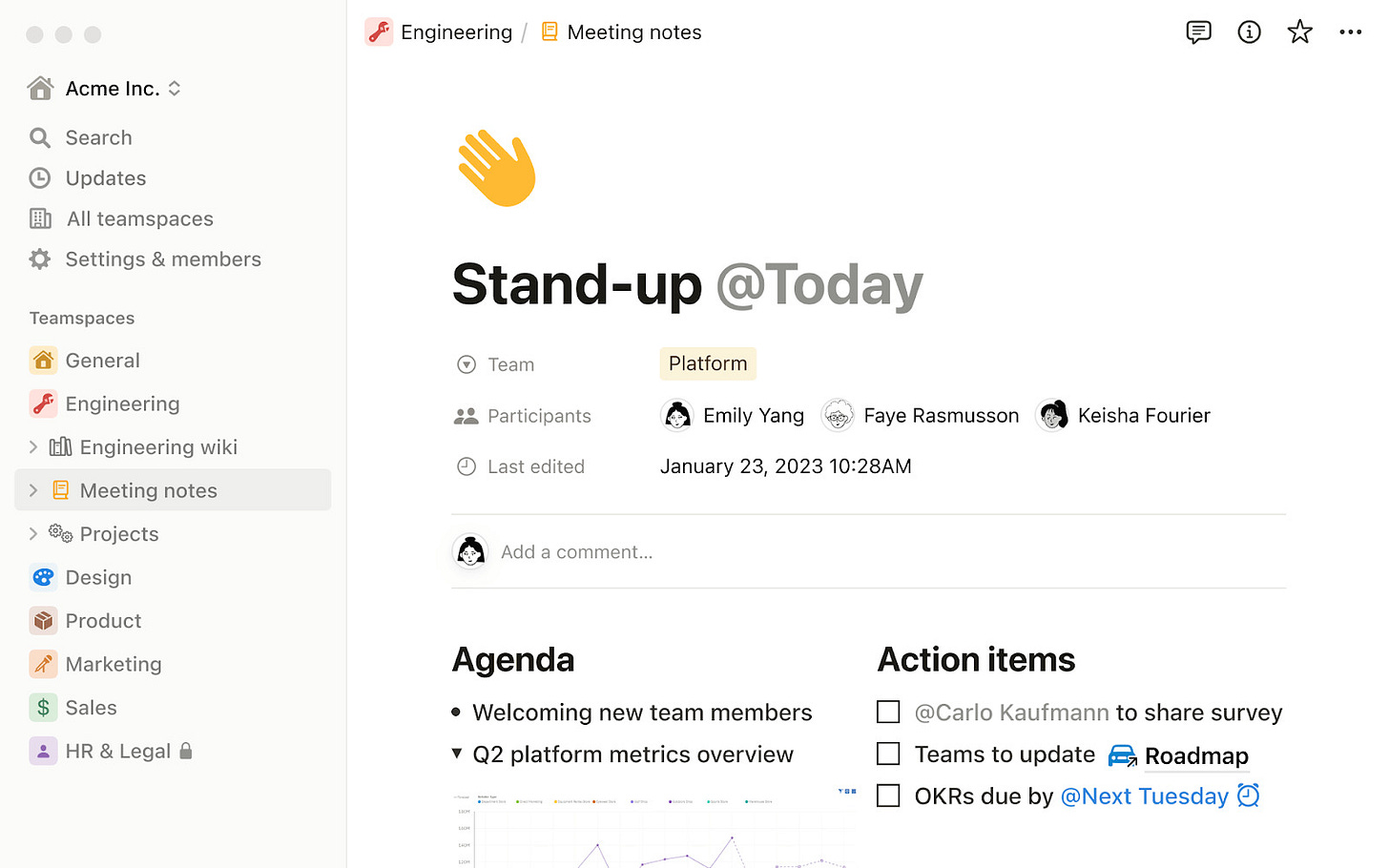
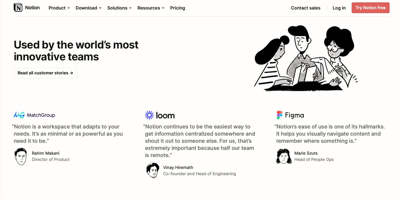
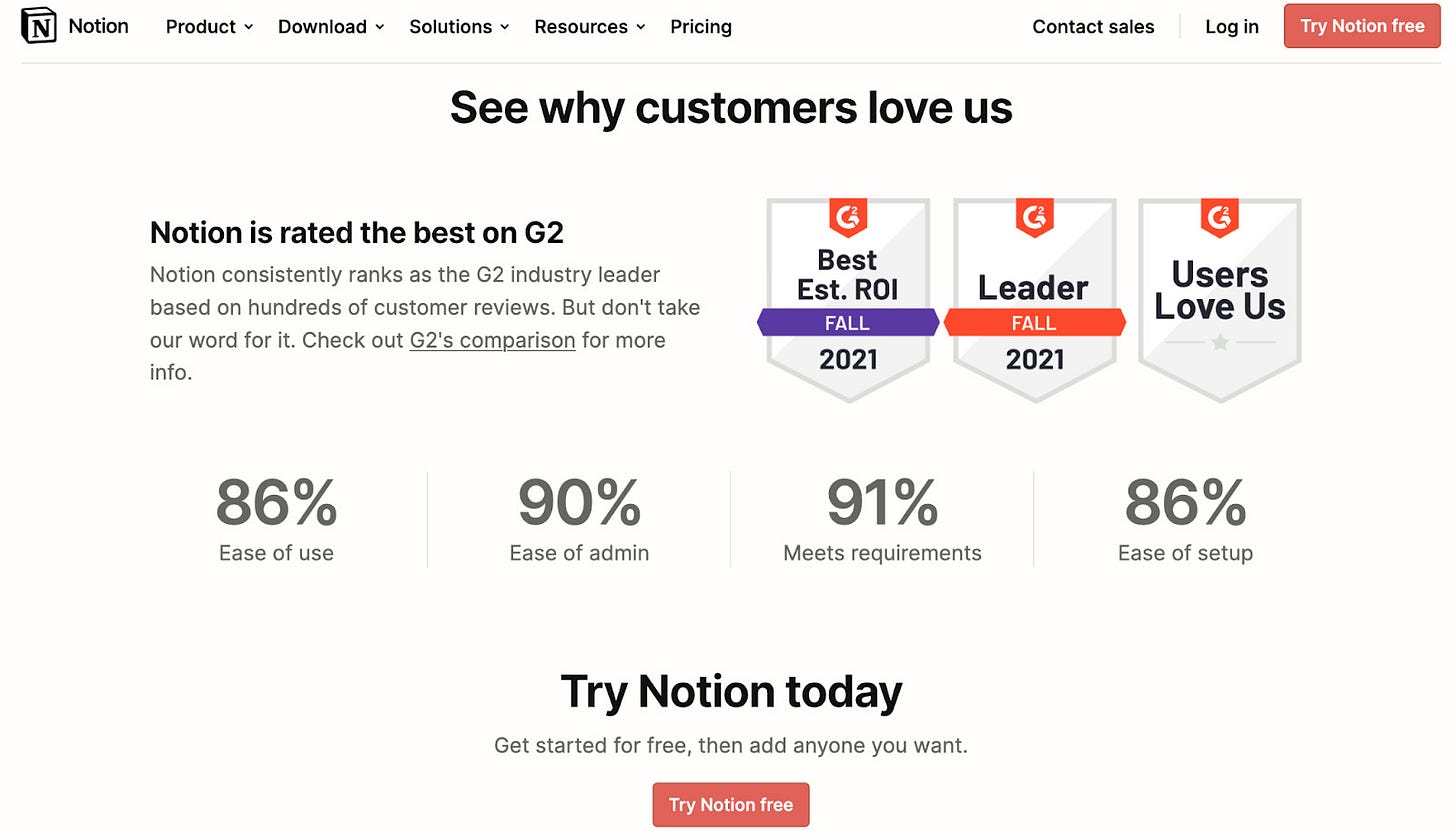
In these four interface displays alone, Notion ticks all the boxes representing the six variants of social proof.
⭐️ Notion puts building trust front and center
Notion showcases user testimonials and ratings from trusted platforms, enhancing its credibility. This real-time feedback demonstrates that many users value the product, reassuring potential customers and encouraging them to try Notion.
⭐️ They show all kinds of proof and easy to say yes!
The landing page uses social proof, featuring customer success stories and recognizable company logos. This highlights Notion's popularity and builds trust with new users by showcasing reputable organizations that use the platform, creating an immediate sense of reliability.
Favorite cancellation flow: Figma
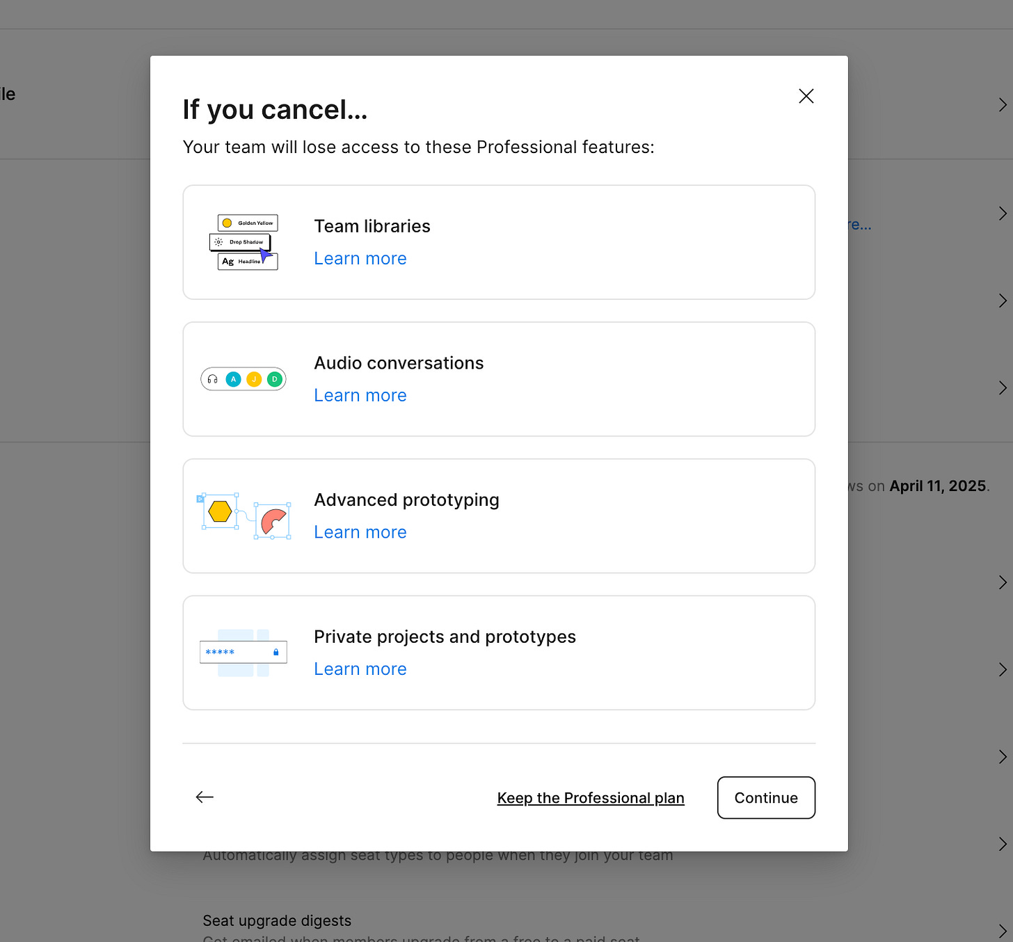
I haven’t canceled our Figma; we love it. But Figma’s cancellation flow was so good; and it’s great because they had listened to the comunity. And, no, it wasn't because they made me jump through hoops.
Things I loved about Figma’s cancellation flow:
I went to cancel my Canva Teams account a few weeks ago. Canva's cancellation flow was so good that I changed my mind (and went unexpectedly viral). And, no, it wasn't because they made me jump through hoops.
Things I loved about Figma’s cancellation flow:
🌟 They gave me a very transparent view of renewals.
This is counterintuitive. Most companies don't remind you that you have a renewal or late fees, etc, for fear you might cancel (*banks*). But Figma chose the user-first path and helped subscribers opt-in to renewal reminders and share transparent renewal dates.
Golden rules of good cancellation flow:
✅ Reinforcement of value
✅ An exit survey
✅ Alternatives to cancellation
✅ Yes, a cancellation button
🌟 They created loss aversion by reminding me of the premium features
Did I use the 150 files and 19 projects with my team? That’s a lot of design files that we could lose. Aversion is a big part of why reverse trials work so well, too. After you've tried a premium feature, you become much more hesitant to lose it.
Frequent reminder email for upcoming renewal:
Favorite free trial design: Blinkist
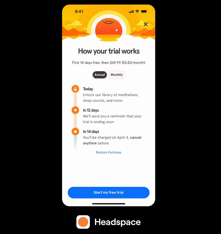
Blinkist popularized this free trial design. By providing a very clear step-by-step breakdown of it’s 7-day trial period, including reminders on Day 5 and details on the charge on Day 7.
These changes are designed to provide more transparency, reduce the friction of canceling the trial, and improve user confidence in starting the trial by emphasizing ease and clarity. (full case study here)
The results prove to be *extremely* successful:
✅ 23% more trial signups
✅ 55% fewer customer complaints
✅ Increased push notification opt-ins from 6 to 74%
🌟 They gave an obvious timeline that creates confidence
Ultimately, as we keep learning, users value transparency and honesty, and ultimately, this increases conversion. I like that because I am busy and could forget to cancel; this acts as a good backup—so it becomes a “why not.”
🌟 They added a long-term win for the product; notifications are on!
Getting users to opt into notifications with no context is hard. But if you tell them that this notification will save them $100+ if they want to cancel, then it’s an easy win + of course, they are opted in for notifications forever; this helps with engagement.
🌟 They changed for free trial design worked for everyone

